Objective three: review of current interfaces
The final section of this research will go through the current implementations of Lightning Network wallets with graphic user interfaces to point out the main good and bad design decisions that are being made. We have to consider, of course, that all the candidate clients for analysis are in a very early stage of development and are not actually functional yet. Due to that, there will be an effort to differentiate between what seems to be a design choice and what is a temporary implementation bug, since only the former is relevant here.
Another relevant thought is that some of these wallets might have been created with demonstrative purposes only and, because of that, developers consciously didn't worry about details and usability issues. Even so, they will all be considered here as wallets on the process of improvement, so any relevant issue will be pointed out in a way that it can theoretically be corrected in the future.
Additionally, since the focus of the research is on usability and general user experience on the Lightning Network, aesthetics considerations will only be made when they directly affect those aspects (e.g., a cluttered interface that increases cognitive load, fonts that are too small to read, etc).
Three different wallets will be used (in testnet mode) and compared with the guidelines defined in Objective two.
The scenario followed when going through the wallets was that of the execution of simple expected operations (sending and receiving payments) and a basic exploration of the interface as a whole (visiting and trying to understand the main available pages and sections).
The first important observation is that some of the current implementations do not open channels automatically for the user, requiring them to search for the peer they need to connect to and manually open a channel. This wasn't even considered as an early development necessity in Objective two because the required network structure for automatic opening of channels already exists as LND's autopilot feature. Although the network discovery methods will probably improve over time, the removal of the main burden of opening channels manually can begin right now. The expectation of the researcher is that, by the time functional releases for mainnet use are being distributed, this feature will have been implemented by the development team of all these interfaces.
Another general aspect of the current wallets is that, probably due to the early development stage and the fact that they are only being used as testnet wallets, not all of them have implemented a proper set up for the wallet regarding the security and backup. That's not a big issue if it's fixed before the wallet becomes usable in the mainnet.
HTLC.me
HTLC.me is a web-based wallet created by Alex Bosworth with the basic necessities for the Lightning Network operation. The test described below was conducted with the wallet's running version in the last week of March 2018 using the Firefox Quantum 59.0.1 browser. The greater perceived strength of the wallet is that it's very straightforward in its use and its greater issue is the lack of options (user freedom and control) and explanations for each activity. These aspects might be considered a counterbalance to each other and HTLC.me weights too much on the first side.
The first screen shows the amount available in a Bitcoin unit and in US dollar, as well as the three main sections of the wallet: send, receive and network. The wallet doesn't allow a blockchain funding operation, instead, it starts itself with the amount of 0.00016000 tBTC. This is probably due to the merely demonstrative purpose I mentioned before.
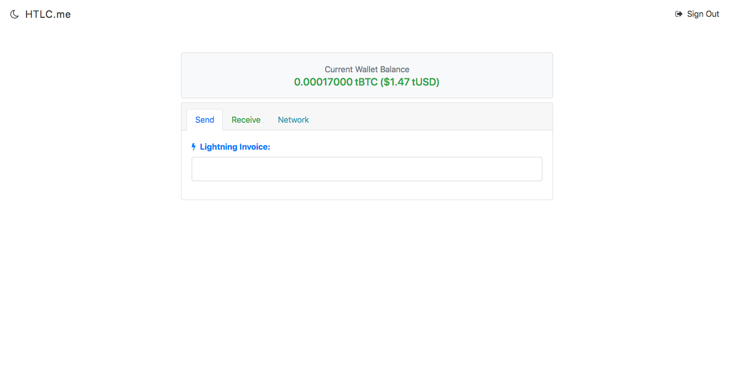
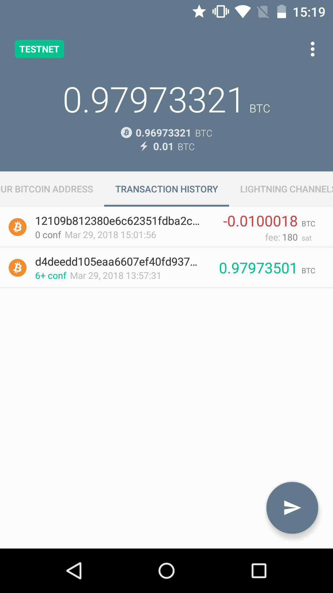
Since there's no setup process available for this wallet, the first operation will be an emblematic coffee purchase, using the Startblocks demo website. As expected when proposing the wallet's sketches, the merchant provides both an easy way to copy or to scan the payment code. In the case of HTLC.me, only pasting or writing is possible, a scanning option would need to be implemented.
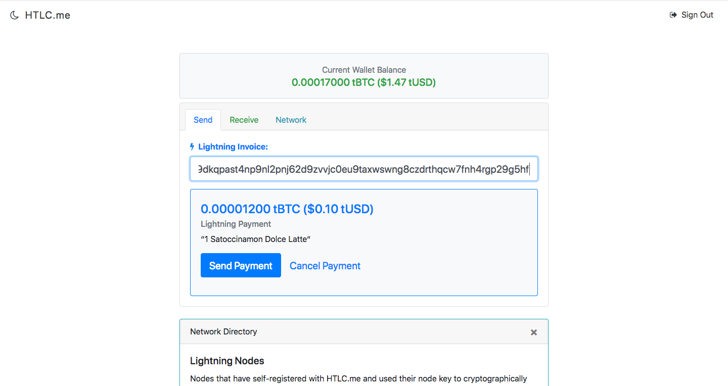
As soon as the payment code is pasted, the available information about the purchase is displayed. It's a perfectly timed feedback for the user before he confirms the payment.
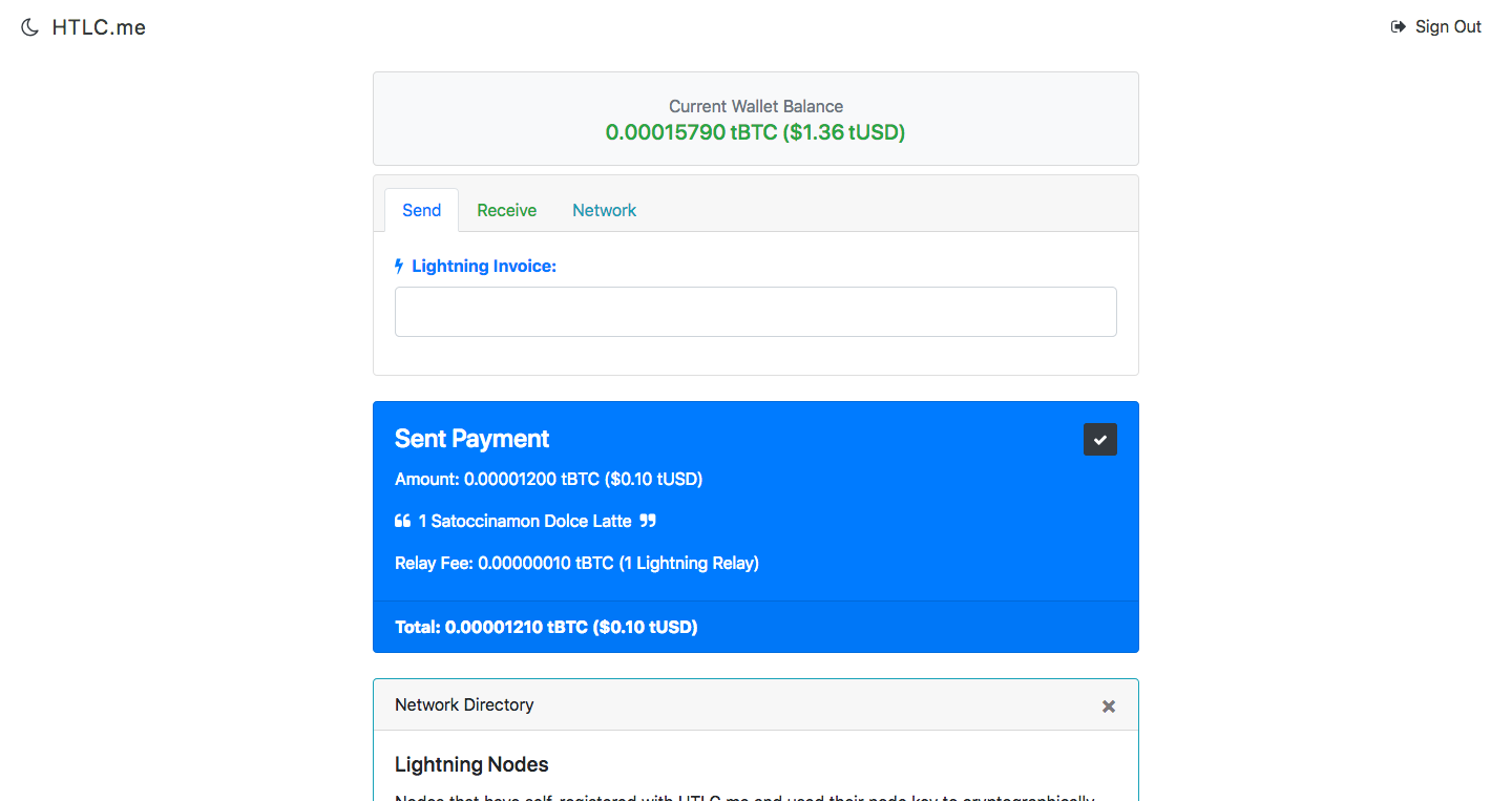
After sending the payment, a confirmation screen with the transaction details is shown, which is also a proper feedback system. This concludes the first task of sending a payment.
The second step is to request a payment, which is made in the Receive tab by entering the desired amount you wish to receive. Here, an interlock is applied by only making the "Request Payment" button show up after an amount is written down. This is a good application of an anti-affordance (a lack of functionality that communicates the proper behavior) that tells the user that a payment request can only be generated if an amount is provided. On the other hand, it might create a moment of confusion in case the user tries to understand how to generate the payment request before writing anything in the amount field because there will be no available button. A better approach could be to display the button in an "off-mode", i.e., with a style that indicates that it's disabled (such as a light/greyish color and no link behavior on hover).
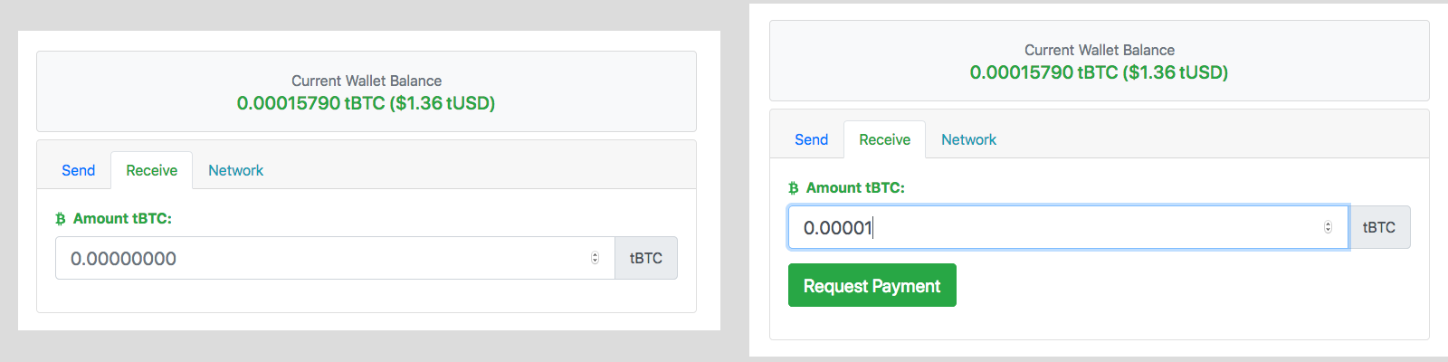
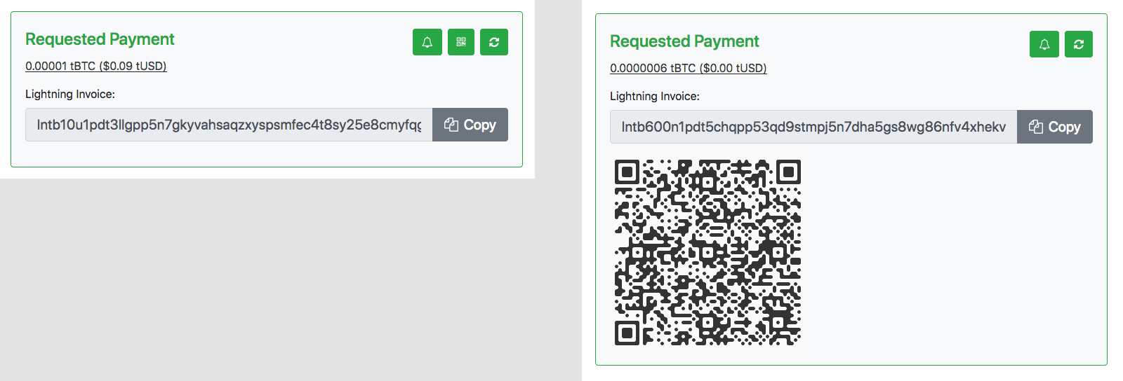
After generating the payment, the code is displayed with the possibility of copying and visualizing as a QR code, as well as with a link that directly opens a wallet application on the device. A notification option (the button with a bell icon) is also provided for enabling browser notification when the payment is received. The button with a "reload" icon was a bit unclear. Its function is to refresh the status of the payment, at the same time that the wallet does this refresh task automatically, so it ends up being a button with no apparent function. Since the button is probably there to cover the case when the wallet doesn't refresh automatically, maybe there could be a title tag on the image saying "Force refresh". It would give a better explanation of its purpose.
Here's the feedback when the payment is received (with enabled browser notification):

Note that no manual channel opening was required until now. That's because HTLC.me already starts itself with a list of connected peers, as it can be seen in the Network section.
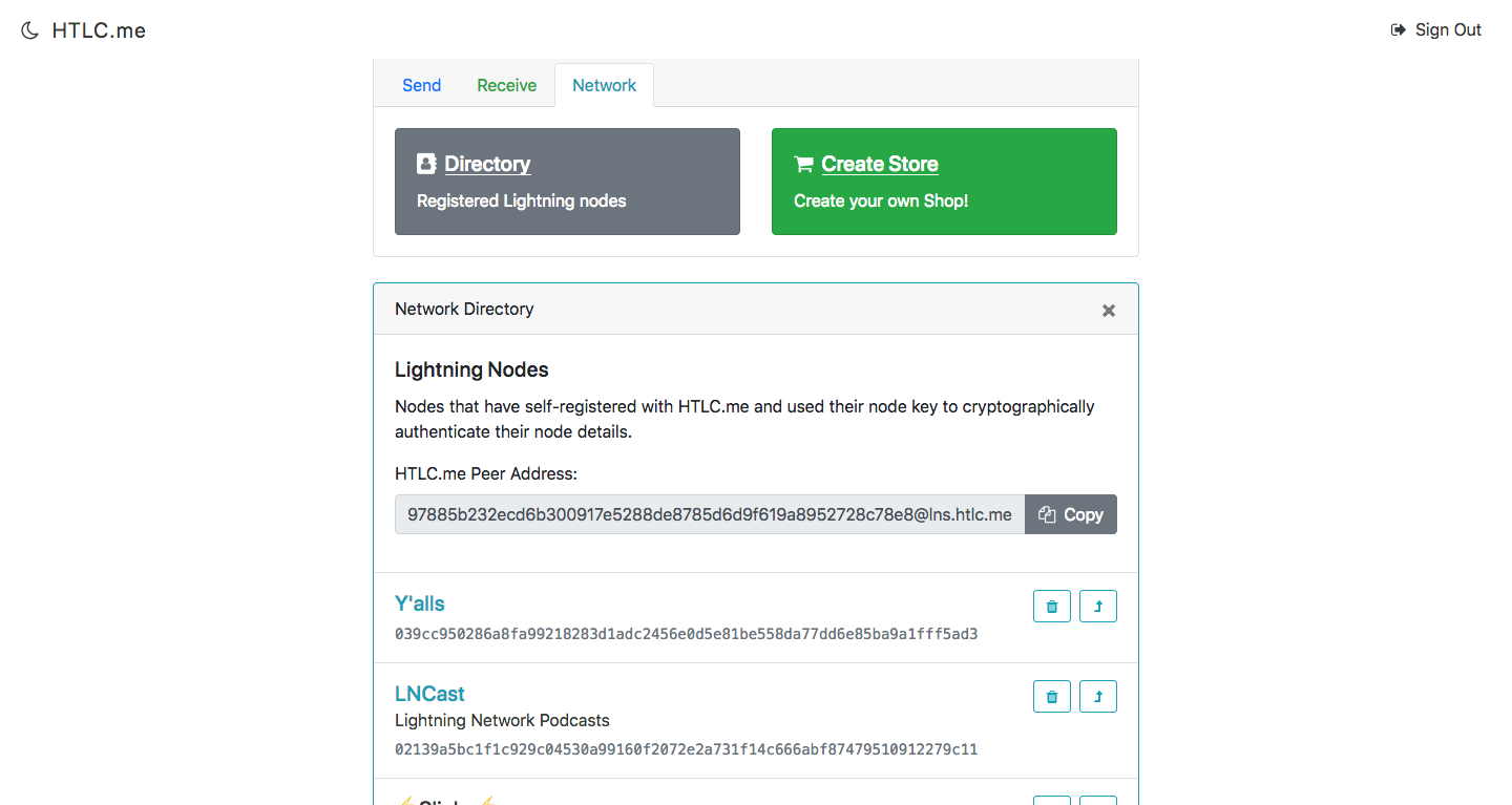
That's exactly what was mentioned before about removing the burden of opening channels of the user's shoulders, and HTLC.me does it quite well. What it apparently doesn't cover is the possibility of a user wanting to open a channel with a specific peer that doesn't appear in the directory.
The Network directory is also where the user's own peer address is shown, which, even though is not the placement that was suggested in Objective 2, it's a place that makes contextual sense.
One last adittion about HTLC.me is that, even though there's no place to manually add a peer or open a channel in the regular interface, we did find a way to connect to new peers that is only shown in a specific context of the wallet. It happens when the user tries to make a payment but the wallet encounters a network error.
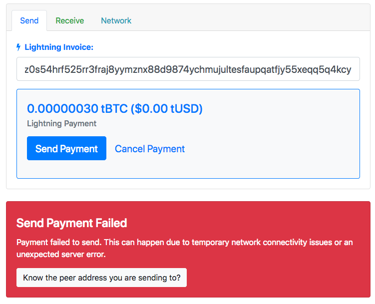
In this moment, the wallet asks if the user knows the address of the peer he wants to pay. If he clicks, he sees the following:
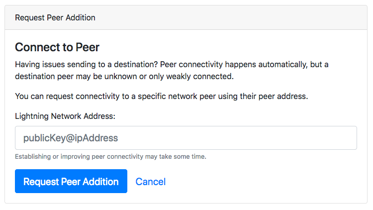
That's actually a very good context to display this option since it won't be needed in a regular situation that a path can automatically be found to complete the payment. And it gives a short but good explanation of why that's appearing there and what to expect.
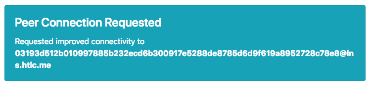
Finally, it gives the feedback after the peer addition is requested.
Zap
Zap is a desktop wallet developed by Jack Mallers and other contributors. Since it is an interface with more features, it naturally will have more elements to be analyzed and, possibly, criticized. It has, at its core, the intention of being user-friendly and the general aesthetic of the wallet is very pleasant. This last aspect is indeed important because users tend to perceive more pleasant interfaces as easier to use, so it's also part of a better usability.
The software used for this test was the v0.1.0-beta release for MacOs and it was run on a macOS High Sierra v10.13.3.
Beginning with the first opening of the wallet, it presents a dark screen with an animated loading icon that counts a percentage of loading and a carousel structure in the middle with various slides of written content.
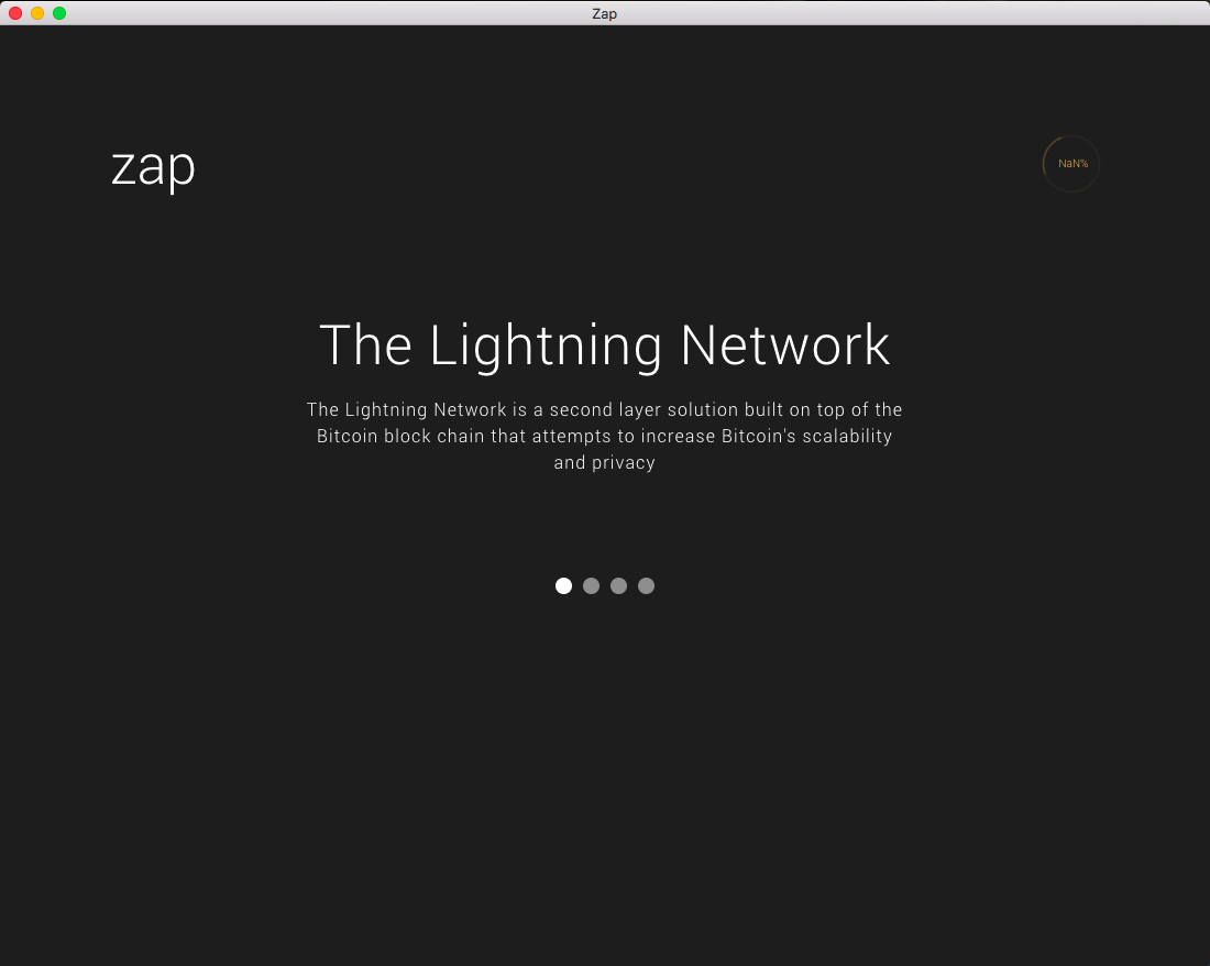
At the time of writing, this first experience with Zap already started with some degree of confusion for the user, because the loading process takes a long time and no explanation was given about what was being loaded. It looks like the user is stuck on the first page. This issue had already been pointed out in a Github issue and it appears that it is going to be resolved with the addition of a "Syncing to the blockchain..." message.
Still on this same page, the carousel can only be navigated by clicking the circles in the center of the page. Those circles convey the message of how many slides there are and which one of them is activated. They do not, however, give the impression of being navigable links. Therefore, the carousel navigability should be improved by allowing direct control through keyboard arrows and by adding some signifier on the screen, such as left and right arrows, to better indicate where one should click to change items.
Also, although the explanation about the Lightning Network is timely and clear, the other elements that are explained ended up being so superficially described that they not only fail to convey a useful knowledge but might even make users more confused. This moment the user has to wait for the syncing could be seized to give a more practical explanation about the wallet and its usage, accompanied by "learn more" links that will lead the interested person into a page with a proper explanation for these technical concepts.
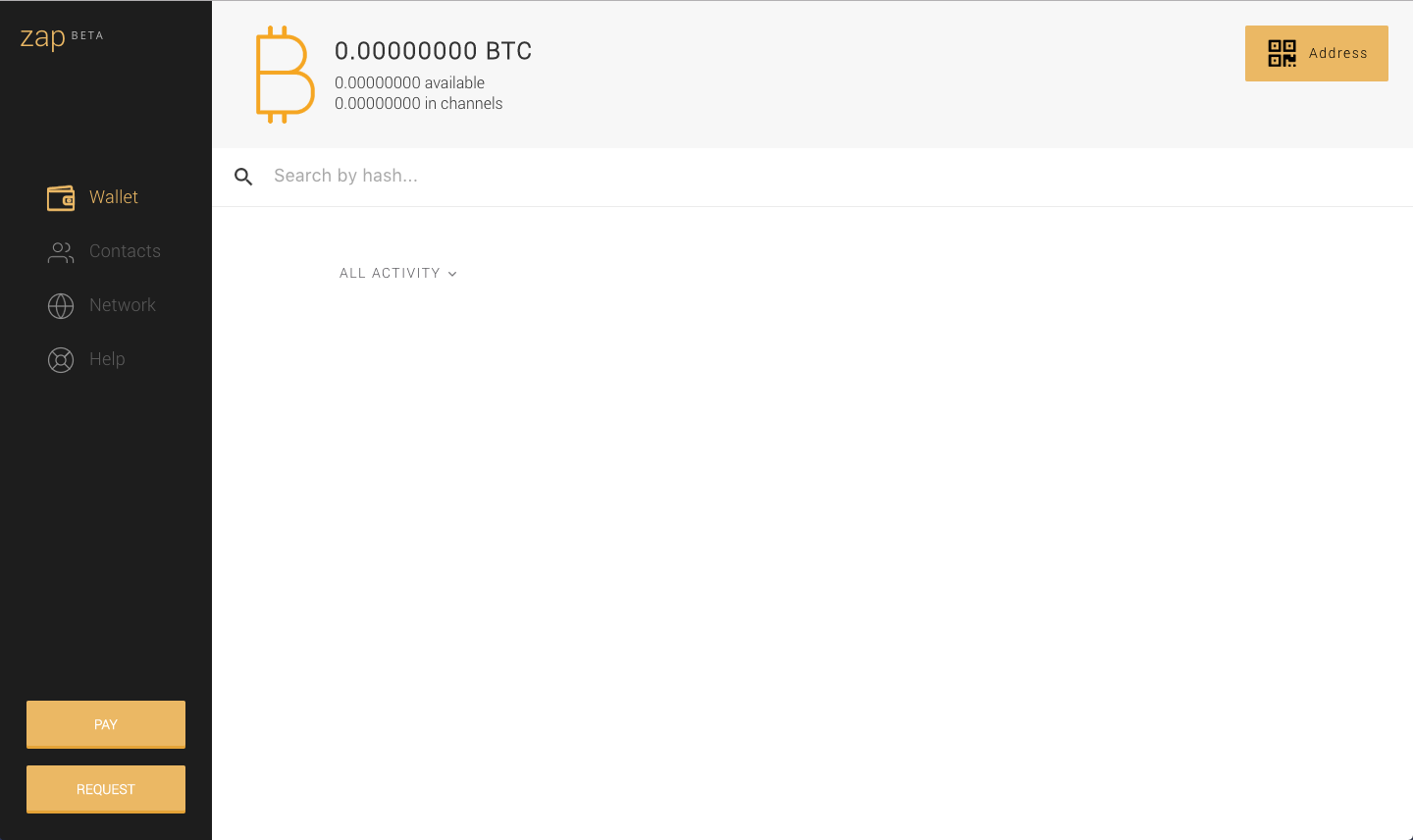
When in the wallet, the first screen to be shown is an empty activity page. A mere suggestion here would be to include small explanations about each section while they are empty, so the user understands what will go where at the same time that gets more information about how the Lightning Network works.
Since the wallet setup flow is not yet implemented, we're going to straight to the second flow from Objective 2: making a payment. As this is the first time the wallet is being used, we need to fund it with a blockchain transaction. The two candidate elements to perceive this action are the REQUEST button and the Adress button. This trial and error approach to find the correct path is an indicator of inappropriate design choices, as the user shouldn't have to be in doubt of where to find a way to put money in the wallet. Maybe the labels or groupings should be revised.
We soon find out that the REQUEST section only creates lightning requests and that the Address section is where you can find a blockchain address for the wallet. Now let's take a look at where it takes us:
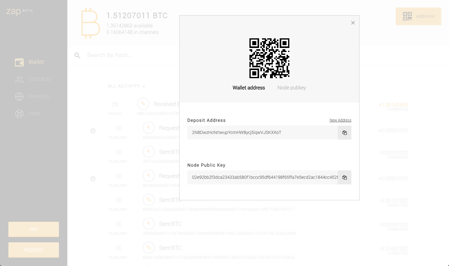
First, there is an inconsistent naming in which the blockchain address of the wallet is called "wallet address" in the QR code section and "deposit address" below. Also, this display is a bit confusing as it is, in practice, divided in "QR code section" and "written address section". A more semantic division would be "deposit address section" and "node pub key section", each with a button to show the desired QR code.
Anyway, the required address for a blockchain transaction is there and we'll use it to fund the wallet. Once that's done, we can go on with the Lightning payment task.
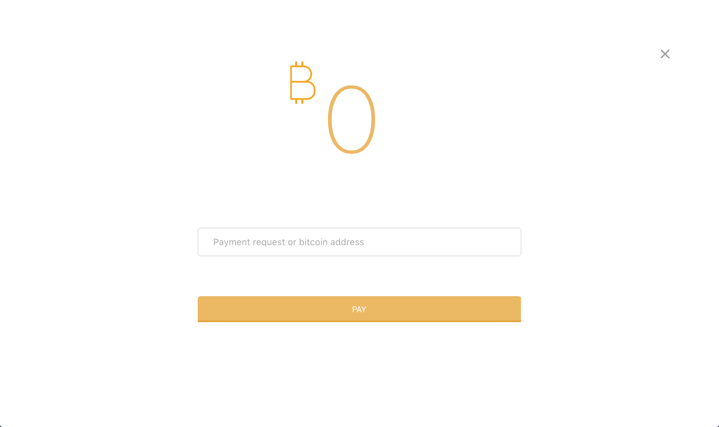
The PAY button is relatively easy to find but it does have a usability problem that's worth mentioning.


The background color is a light yellow and the font used is white, thin and not very large. That's quite hard to read, even for someone with an OK vision. It's an accessibility issue that should be addressed somehow (making the font larger, bolder, changing the font color to dark grey or changing the background color to a darker yellow). The same is true for the REQUEST button, but not for the Adress button, which has a dark grey font.
The payment page is now open.
Again, we'll use the Starblocks page to make our purchase and get a payment code to paste in Zap.
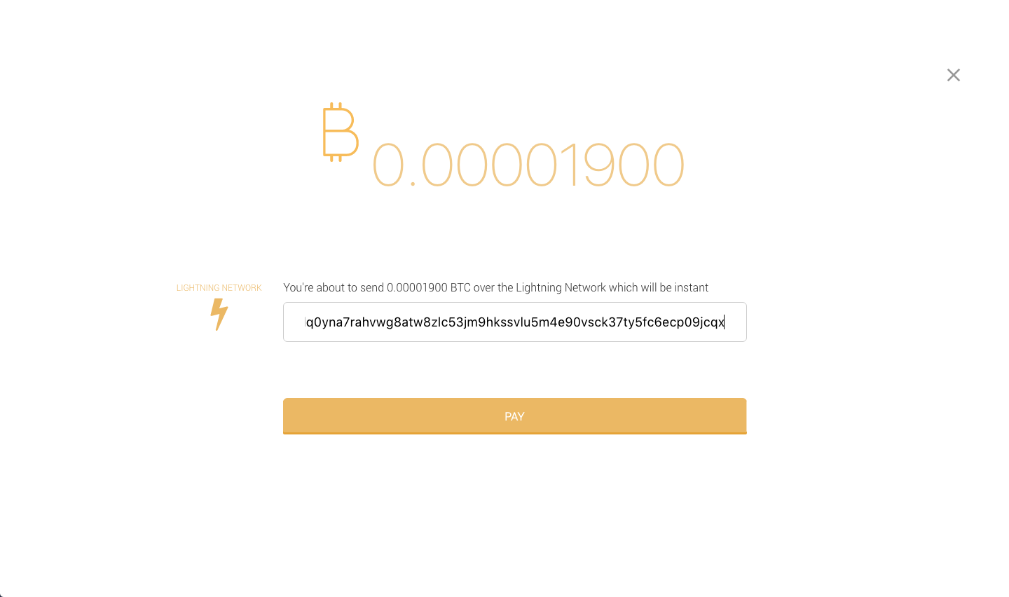
It automatically completes with the amount of the payment and gives the feedback about the code being a valid Lightning Network payment. Although it is interesting that the page is very focused on the minimum of necessary elements, there are some extra information that could help the user, such as the previously suggested conversion of the amount to fiat currency (in a smaller font) and the possibility of adding a label to the transaction, in order to make it easier to find in the future when its listed with many others. After all, a great use case of the Lightning Network is exactly to make various small transactions, so it's likely that the list of past transactions will be very extensive.
Let's hit pay.
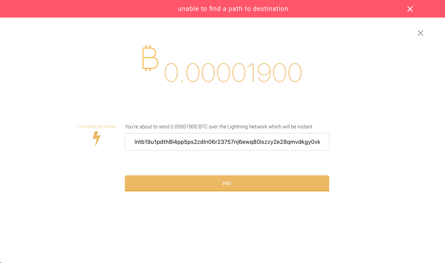
The transaction couldn't go through because there isn't a path to the peer we tried to pay. This means that Zap is one of the wallets which is being initially developed requiring users to open their own channels by hand every time they need. We aren't going to deeply analyze this process because this study's recommendation is that this situation is reverted before the software is actually released for users on the mainnet. But we'll go quickly through the steps since they will be necessary to complete the task of sending a payment.
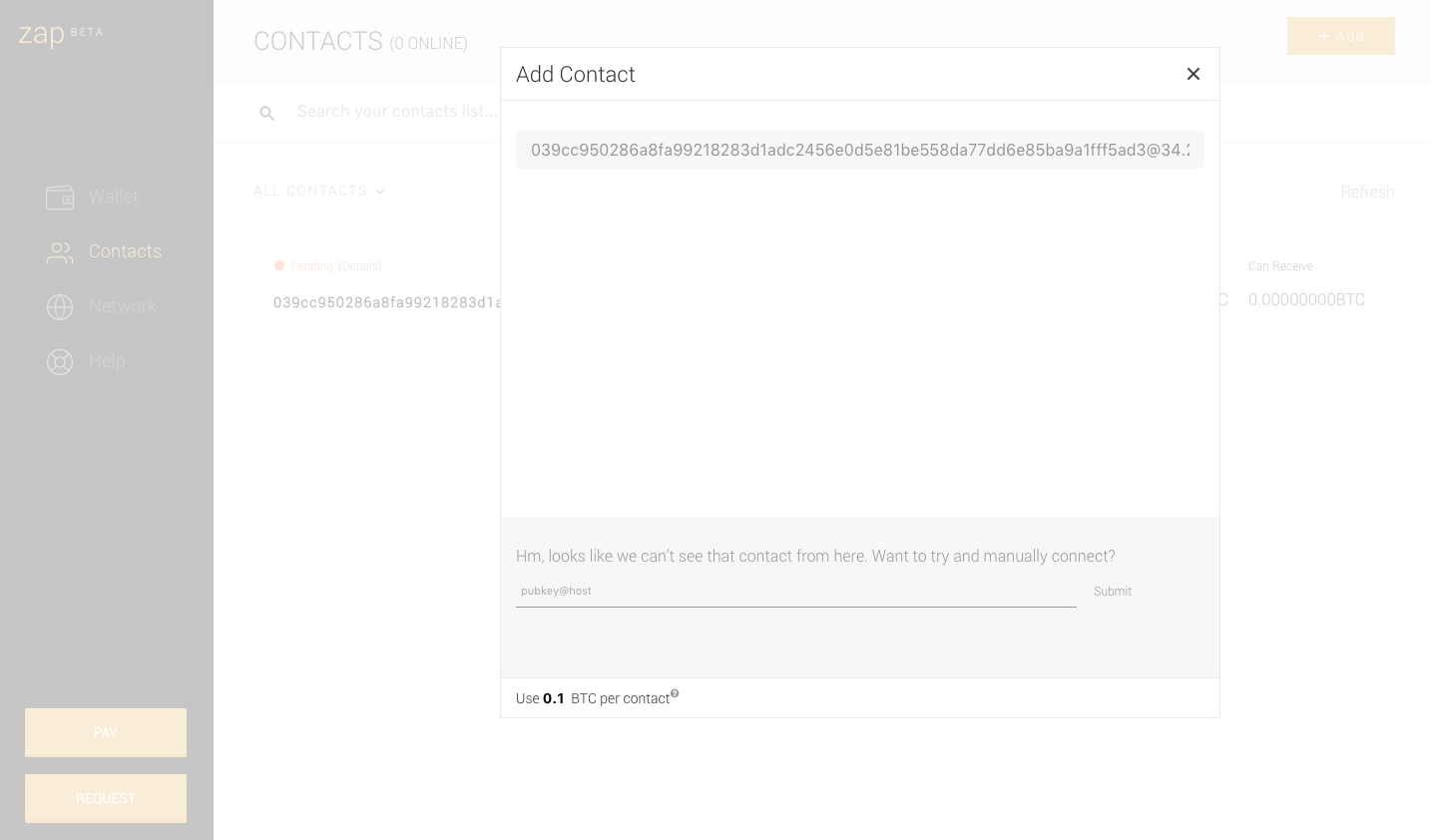
That's the page for adding a new contact, i.e., opening a channel. Some of the main perceived issues are:
- The contrast in the grey section is very low and one of the main elements of the page, the submit button, practically disappears because of that combined with the small font size.
- The label "pubkey@host" could be more helpful if it displayed an example of the numeric format that is expected, such as "022f0edb0d6a8e19320e949a6f24fd4442c390ba1f38f8349b92ee0ee6cbdece08@35.229.31.135:9735". The visual cue of what the user is supposed to input is very important if he doesn't know exactly what he is looking for (as he might not know what pubkey and host are).
- The amount that is to be committed to a channel appears as a small detail on the bottom of the page (it's shown after the "submit" button) and it doesn't look very editable. It would be easy for someone to "add a contact" without even noticing that he had a choice there. This is mentioned in a Github issue.
- Even for future wallets where the manual channel opening is less frequent, it would be useful to be able to add an alias or label to a new contact in order to make it more easily searchable and recognizable. This was also identified by someone else and put in a Github issue.
We finally have channels open:
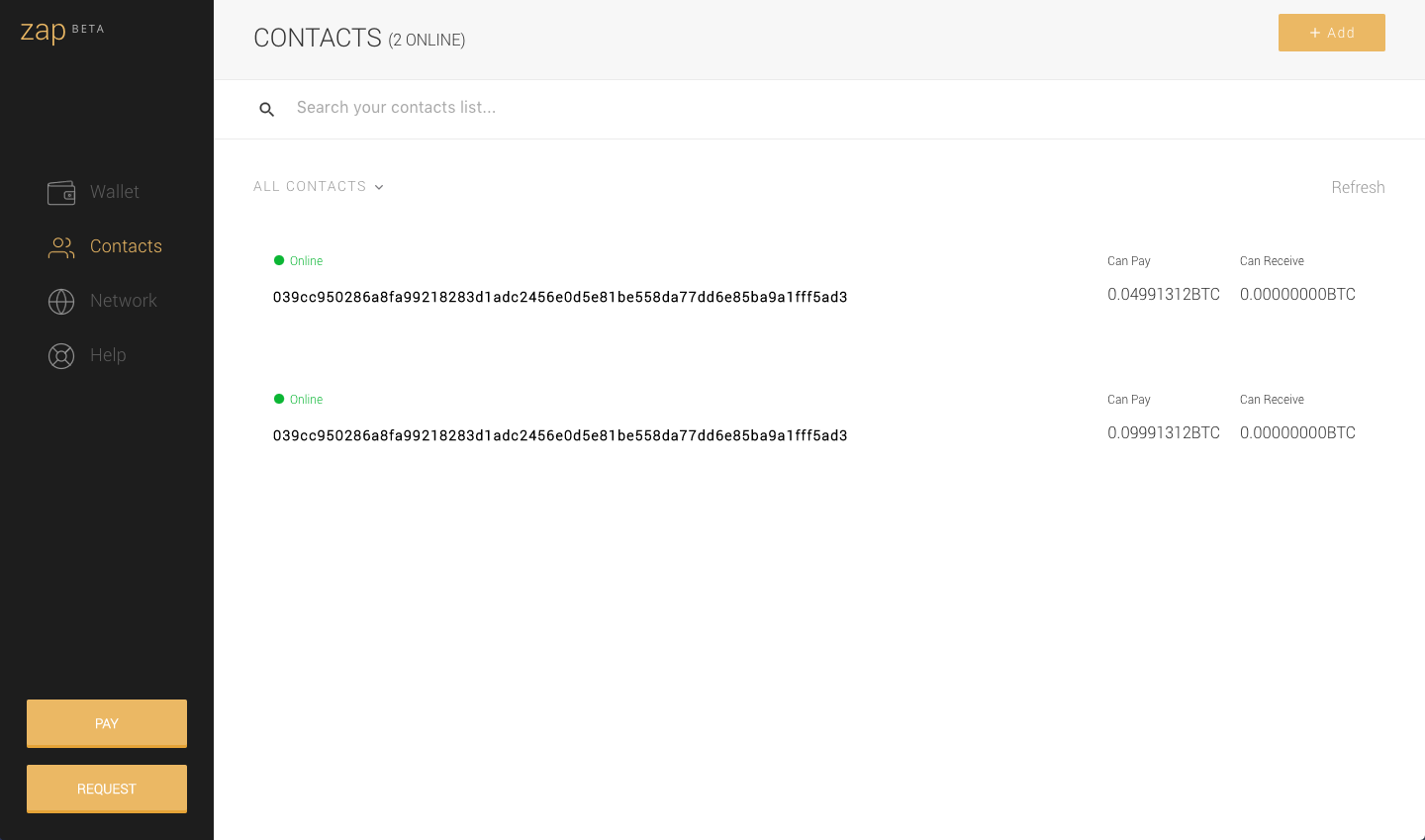
This page of the interface has some very good elements, such as the searching option, a filter for contacts, a refresh option (which could have a refresh icon next to it to call more attention), and a clear display of the state for each contact that is both written and color coded. As for the possible improvements: the already mentioned addition of an alias to each contact and the bad contrast in the "Add +" button (same as in the PAY and REQUEST buttons).
The division of the amount in the channel between "Can Pay" and "Can Receive" is an extra load on the user if he has to keep track of this for every transaction. But in the future case that this page is only eventually used for deliberate manual operations, it can add valuable information.
Now, if we repeat the steps of the payment flow, we will have a successful operation.
Our second task is to request a payment and, for that, we'll go to the REQUEST page.
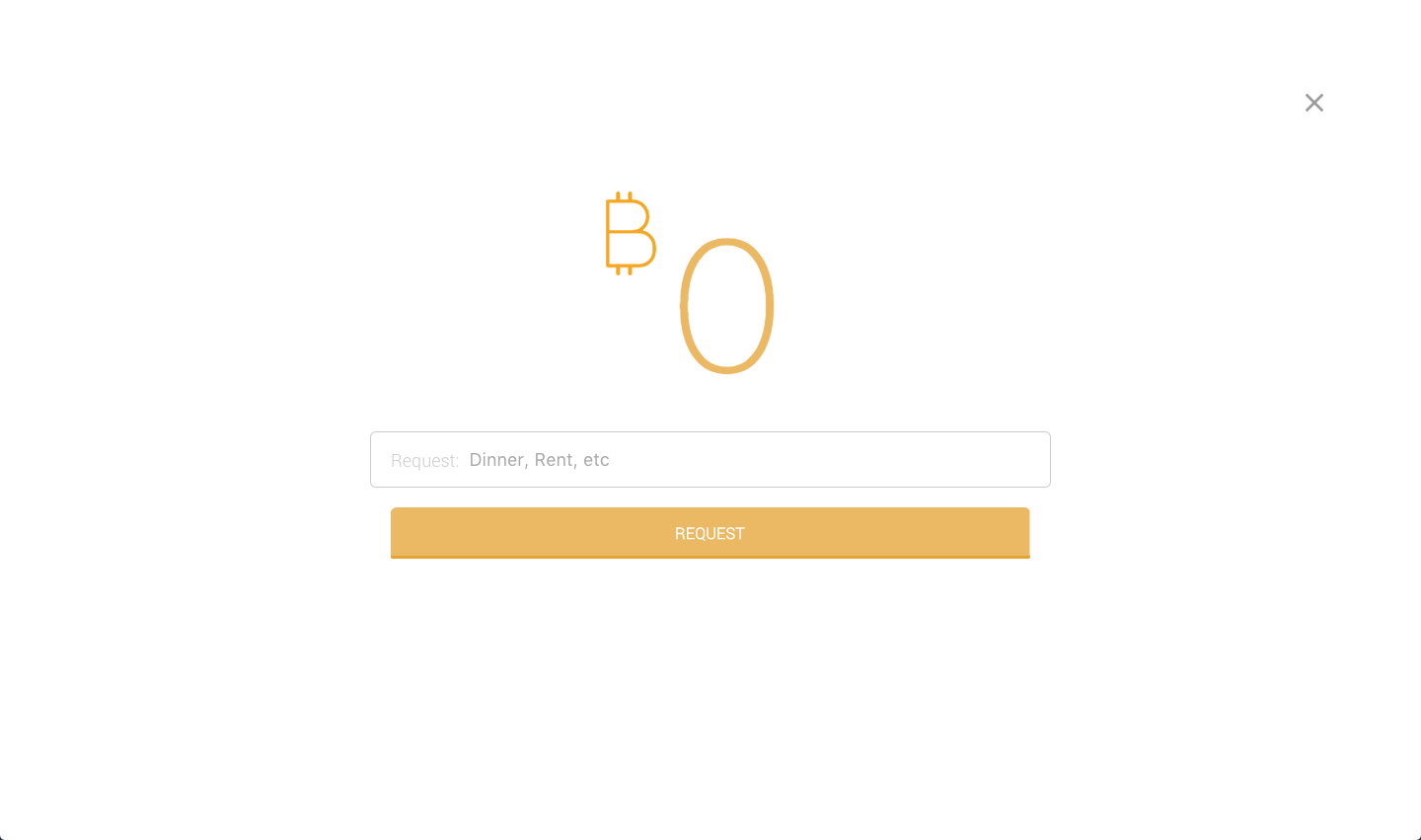
Once you fill in the information with the desired amount and label, you should receive a payment request such as this one:
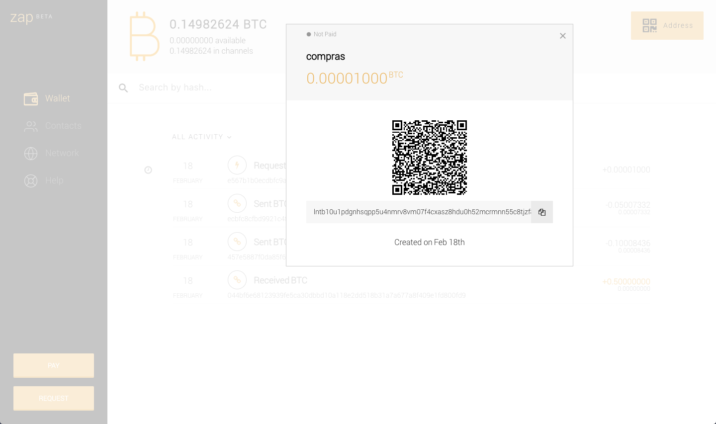
It gives you a visible payment code, an option to copy and to scan, as well as it displays the amount and the label you wrote in the previous step. Besides those basic elements, it also says the date the request was created and its current status (if it was paid or not). It really got all the elements right with the correct visual priority.
With that information, you can share the request with the person who is supposed to pay it and wait for a confirmation. Therefore, requesting a payment was also successful.
After a few transactions, here's what the wallet page will look like:

It perfectly represents the segmentation between Lightning and blockchain transactions, although the "Requested BTC" and "Sent BTC" labels get quite repetitive. That space could be occupied by a more informative label that will help the user identify transactions. The knowledge of how much was requested or sent is conveyed through the positive or negative numbers in the right. It would be even clearer if the numbers were properly color coded as well. At the moment, the only differentiation by color is that for the received blockchain transactions.

There could be a doubt, at first, about the small number displayed under the transaction amount but that is quickly answered by hovering on the number, which reveals that it is the transaction fee. The date of the transaction is also informed, as well as if it's still pending (represented by the clock icon that reveals an explanation when hovered on).
The biggest experienced issue here is that unconfirmed blockchain transactions are not being shown, they only appear after the first confirmation. This is clearly a lack of proper feedback for the user that needs to know if the transaction is on its way but, as stated in the Github issue about the subject, it's probably a temporary bug.
A suggestion for the activity filter would be to create a segmentation in three main categories (All, Lightning and Blockchain) and use tabs instead of a drop-down, which has poorer discoverability. And, when in the Lightning tab, a submenu could appear with more refined options, such as sent, received, pending, invoices and complete. A different suggestion on the same theme was purposed on a Github issue, as well.
With all the tasks completed, some extra comments about the interface are due:

Some messages displayed during the use of the wallet have a funny/playful tone that might not be appropriate to the situation. A wallet is a financial application. The users need clear messages and shouldn't be put in a playful mood because the operations they are performing might result in financial loss.
There is an issue that will be less frequent with an automated channel management, but it's an issue nonetheless. If you open multiple channels with the same peer, you have no warning or indication of that, and the channels appear as completely different. That breaks the conceptual model of "contacts" that is passed on Zap, as you can't have two equal contacts that appear as different entities. That is pointed out here on Github. The suggestion presented by this research is to either drop the "contact" analogy and call it a "channel" or to recognize repeated peers and group its channels under one name/pubkey.
Although not clearly visible at first, a repeated mistake during the wallet's operation has put to light a possible need for improvement. Both on the PAY and REQUEST sections, the label and payment code are requested as normal input fields, clearly recognizable for the user. Even though the amount is also an input field, it's shown in a completely different style (very large and colored), which can pass, at first, as a decorative object. It looks very good aesthetically, but it might be more recognizable if it's displayed in a more input-like style, similar to the other required elements.
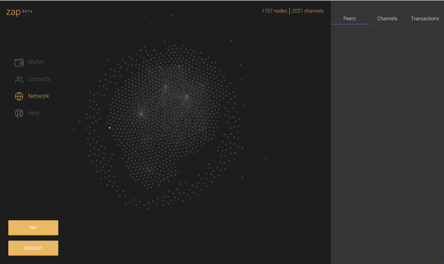
The Network section of the wallet is an interesting visualization model for the discovered Lightning Network and it seems to be going in the right direction in terms of making the map easy to understand and to visualize peer information. It couldn't be explored very well during this study due to still unresolved development problems, but one observation can already be made: is it really something to be in the same hierarchical importance as the "wallet" section? Especially when the auto-management of channels is implemented, this section shouldn't be so prominent as it has less practical use on daily user activities.
To finish the analysis over the Zap wallet, a few comments will be made about the analogy system adopted by Zap that refers to channels as contacts. It is, indeed, a way to make users feel more familiar with the operation of the wallet as they use "add contact" features every day in their lives. As for an "open channel" instruction, it requires immediate new learning and it might create resistance.
But, sometimes, the lack of familiarity is necessary for the user to understand that it is something new that he should be paying attention to. For example, the issue with the amount that is committed per channel being too subtle in the interface is exacerbated by the lack of need for it in the contact conceptual model. Why would someone need to choose an amount to add a contact to a contact list? The issue with the multiple channels opened with the same peer also brings confusion, but it could be solved by the appropriate grouping of channels.
Another issue with this analogy is that, when someone thinks about adding contacts, he usually thinks "the more the better" or, at least, that it doesn't hurt to have a lot of contacts. In this case, it may hurt because you have to commit money to every new contact you add. Also, a person will want to add all their friends and family members as contacts, which is not really useful here and results in money committed to channels, as well.
The moment of suggesting options and trying them out is really now, so Zap's choice is considerably good, at least for the reason of testing. And, as there's no such thing as a perfect analogy, the main focus for future interfaces should be to maintain consistency and standards among different implementations. Other faulty analogies are used in Bitcoin systems every day and it appears that users got used to them so far. But that can only be true because they are the same terms for every app (address, coins, balance, etc.).
At the present moment, we suggest the use of a more accurate expression, such as the "OPEN CHANNEL" from the interfaces proposed in Objective 2. Requiring learning of new systems from users is far less problematic than it may sound if it only has to be learned once. And users don't need to fully understand what opening a channel means to operate the wallet properly, they only need to know is something new and that it works the way they see in the interface.
Eclair
Eclair is the mobile wallet built by ACINQ and it's idealized already as a Phase 2 wallet, meaning it's supposed to be a general purpose wallet for Bitcoin transactions. Some of those might happen to be Lightning transactions while the others will be blockchain transactions. The idea here is that there shouldn't be a design priority for Lightning activity. All that with the promise of a user-friendly experience.
For this study, the installed version was the 0.2.5 in an Android version 5.1.
When you first start the wallet, you can see that it's already providing a setup operation with the display of the recovery seed and the verification of the mnemonic words.
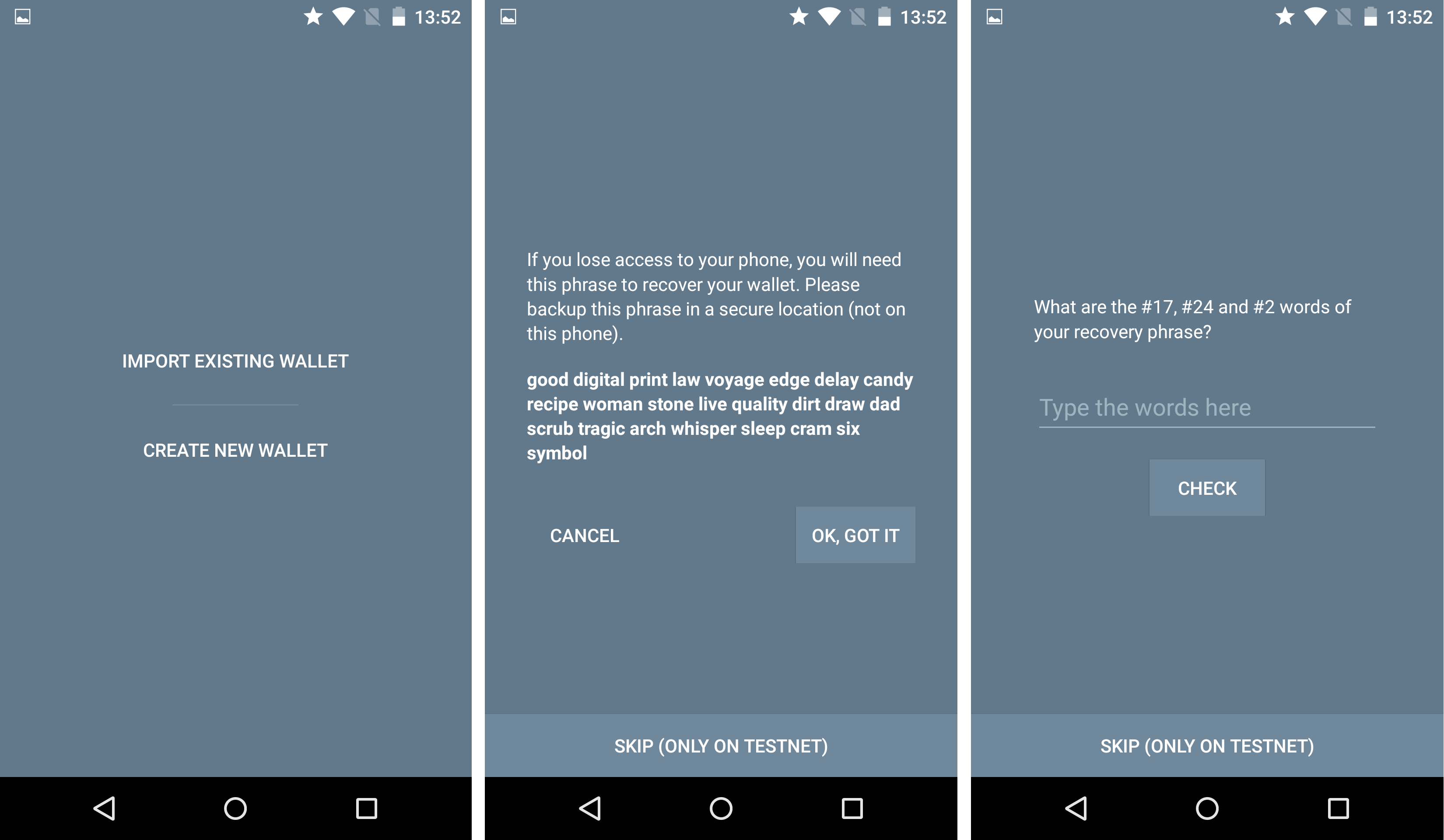
It violates some aspects of what was described in the setup flow in Objective 2, such as the proper spacing, alignment and numeric cues for the mnemonic code. However, since the focus of the analysis is the Lightning activity and the team might have the improvement of this page on their roadmap, we'll take the option of skipping the backup altogether (that will only be the case because it's a testnet wallet).
A first important distinction of Eclair is that it takes advantage of the first moment the user arrives in the app to give a very short but very useful tour through the wallet. That doesn't take away the importance of an intuitive and clear interface, but it does make the user more comfortable with this first contact. It's important to notice that the positive impact of the tour would rapidly be lost and turned into annoyance and over-informing if the explanation was too long — whether it was occasioned by long explanation texts or by too many points being explained —, which is not the case with Eclair.
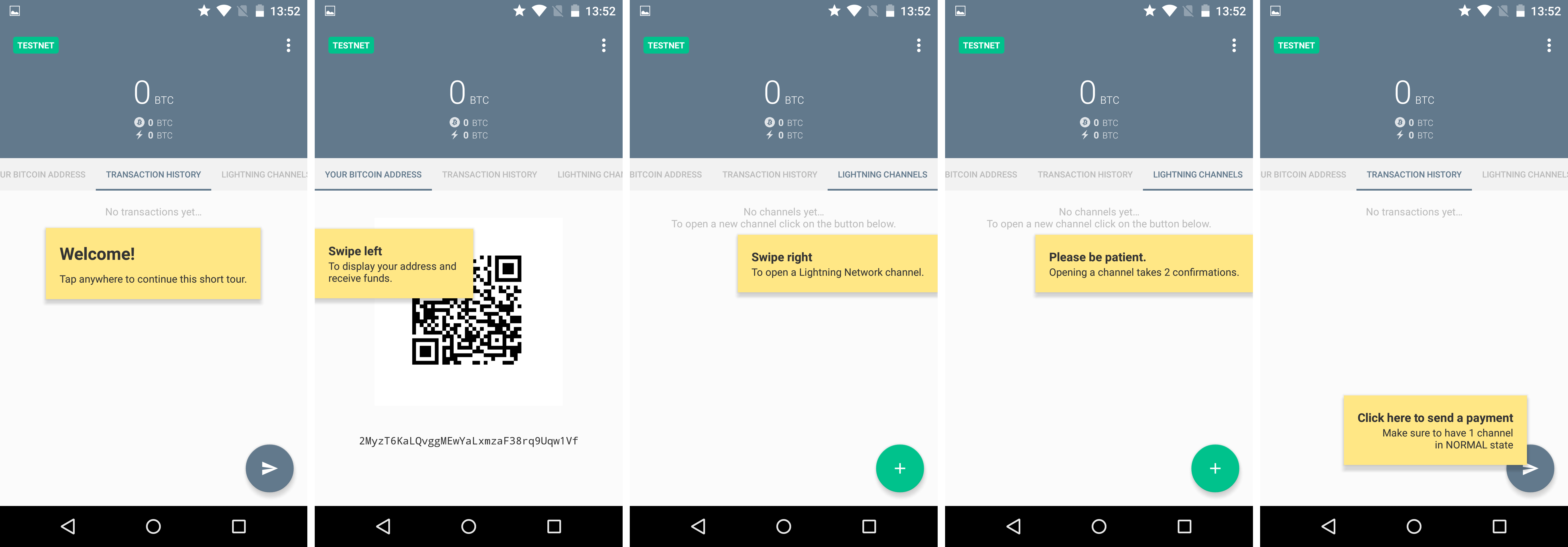
So, now that we need to fund the wallet before beginning the payment task, as it was the case with Zap, we already know where to look.
After funding, we'll make a similar purchase as it was done with the other wallets, using Starblocks. We have an idea of where to go for the payment because of the tour but, by now, the user could have already forgotten the instructions, and he could even have waited days from the moment he started the wallet to his first Lightning transaction. That's why a clear interface should always be the priority.
In this case, although it looks very good aesthetically, the button for sending a transaction doesn't draw enough attention to itself. It does follow a common pattern in mobile apps that put a small circular button on the bottom right corner of the page, and the chosen icon does convey the "send" message. But, if the choice of not having a clear "PAY" button available is to be maintained, this circular button should, at least, be in a different and more bright color.
This also raises the question of where will the button for a Lightning network request be in the future. As they properly explain in their post, the Eclair team justifies that the request of Lightning payments is disabled for the moment so that it doesn't appear as a broken feature until the proper backend structure is ready. But this will be available sometime in the future, which might lead to a questioning of the current "SEND" button. If the same button is to be used for payment and requests, the paper airplane icon used will be inappropriate, as it doesn't convey the message of "requesting", and should be replaced with something more generic for financial transactions. If it isn't placed in the same button, it will either mean that another button will be displayed on the transactions page or that this functionality will be moved to a different page. In the first case, the pattern of the circular button will make less sense, as it is normally used as one button only. In the second case, it will probably result in the "Your Bitcoin Address" section being transformed into a generic "payment request" section. No matter what choice is made, it will probably result in a revision of this "SEND" button.
Using it as it is now, the "SEND" button gives the choice of both pasting or scanning a payment request. The pasting only works if the code was previously copied by the device, which is not obvious and might lead to a mistake in the first time the user performs the operation.
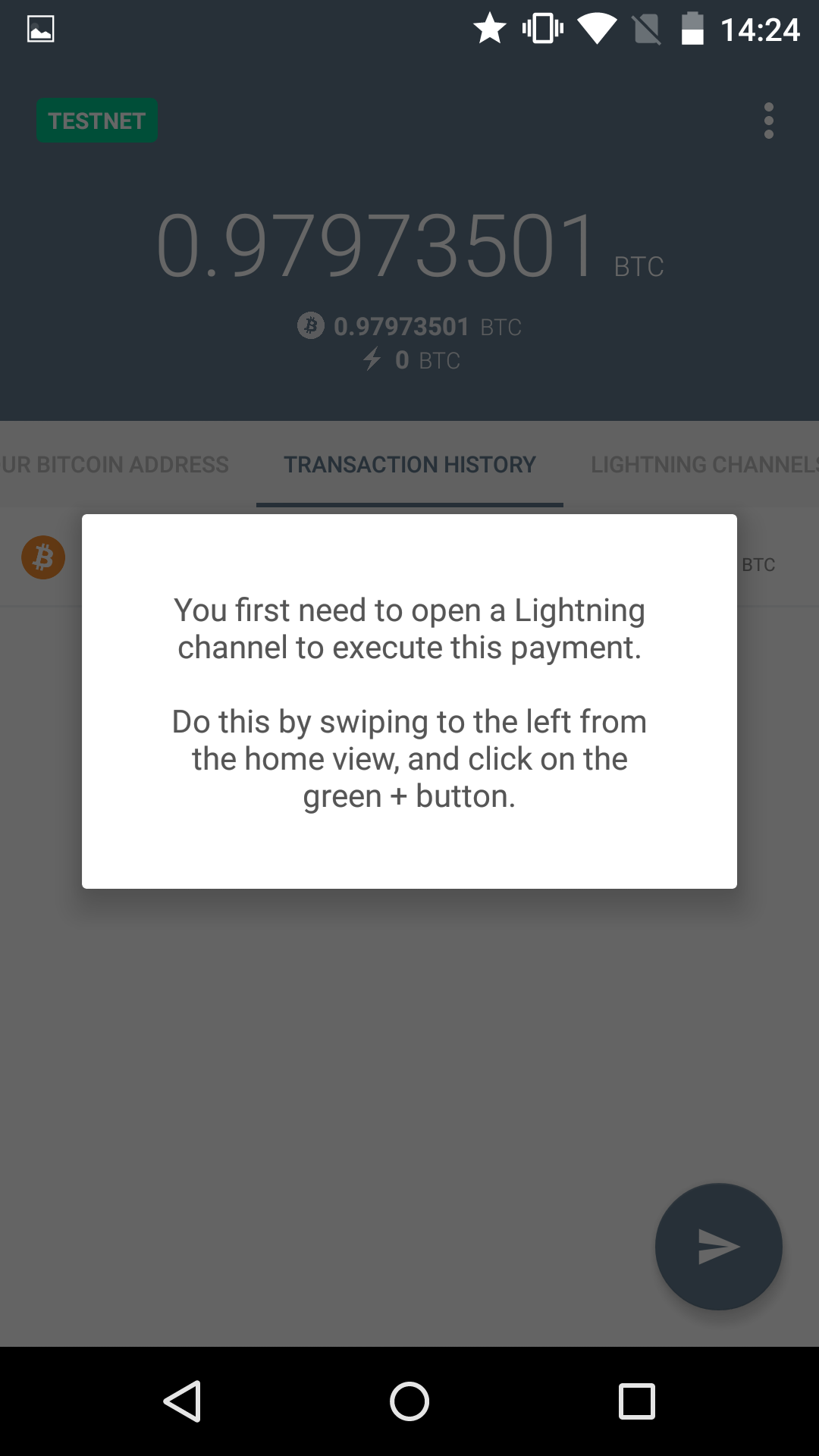
As the payment request is scanned, a message tells the user that he needs to manually open a Lightning channel before being able to pay and it also indicates where to perform such an operation. The break of the user experience due to the manual channel opening requirement was there, but it was much more smooth than the stress caused by the display of a system error with ambiguous messages in a red background.
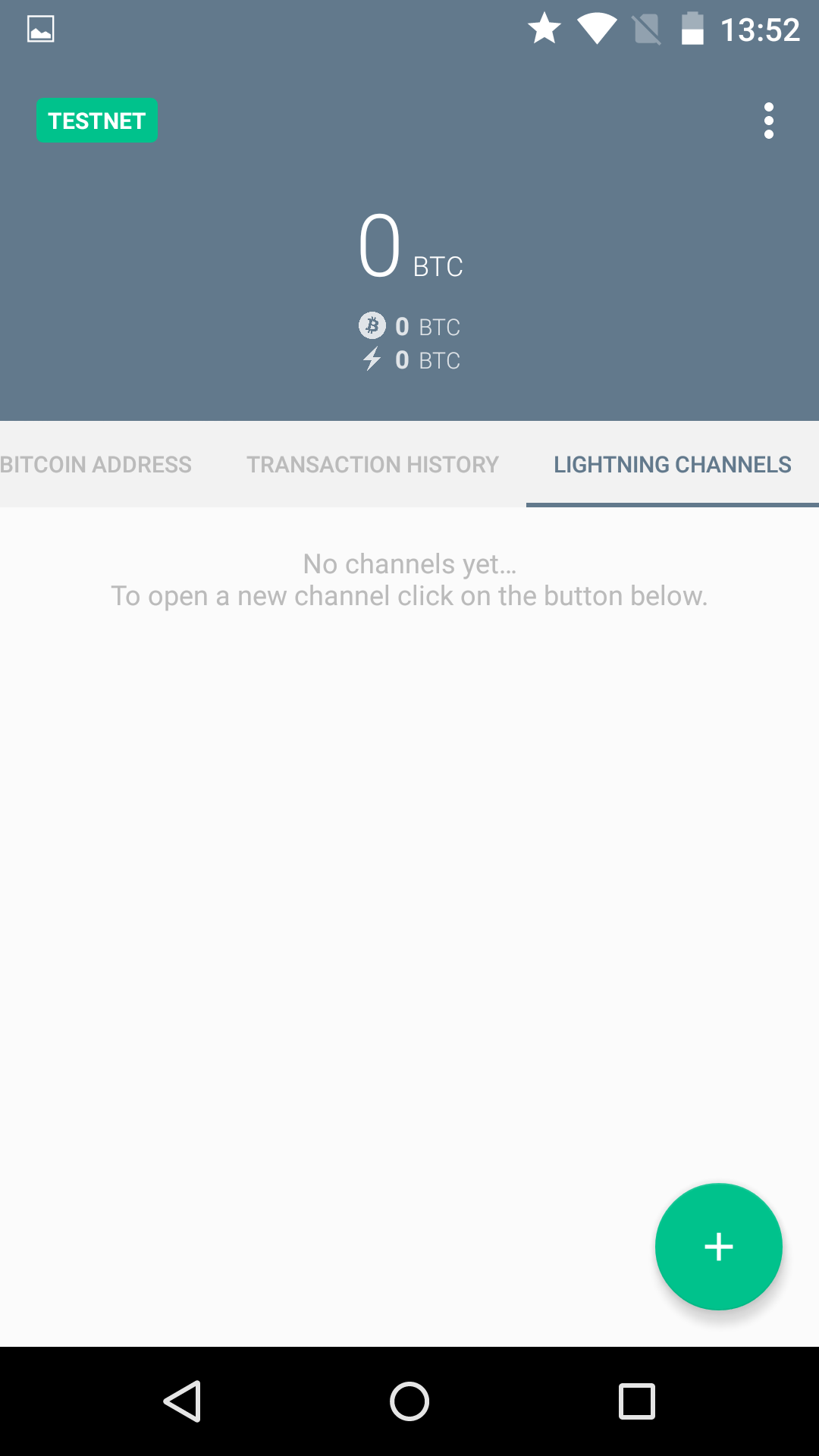
In the Lightning channels page, we see a small instruction taking advantage of the empty space, as it was suggested previously for the Zap wallet. Also, the "NEW" button already calls more attention to itself due to its bright green color, as suggested above for the "SEND" button.
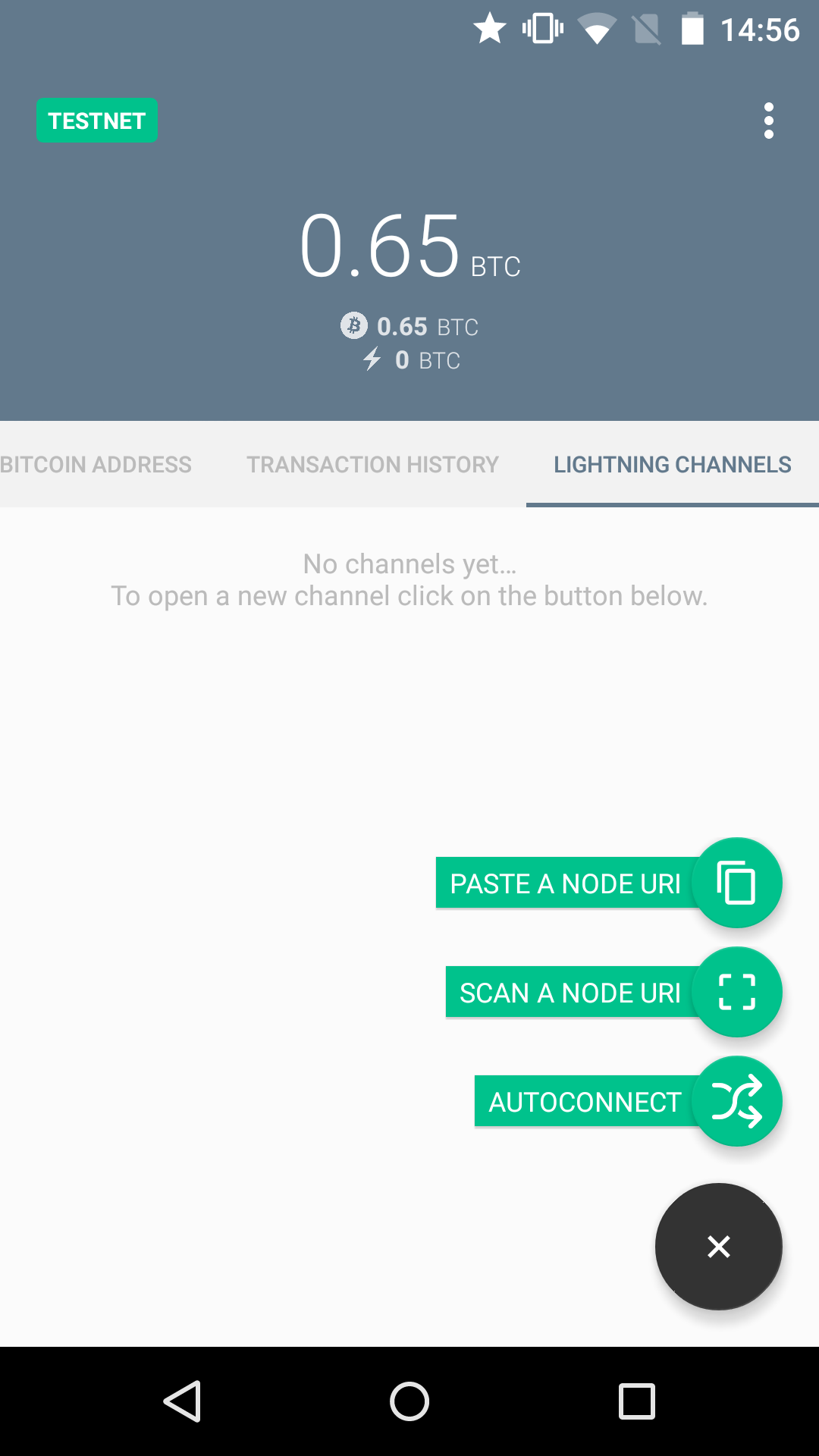
The three options provided for opening a new channel are pasting or scanning a node URI and auto-connecting. It would be nice, in the future, to have a way to a search for peers, similar to what Zap is implementing.
The auto-connect option is, from what can be understood in the blog post, a kind of pre-implementation of an auto-management of channels. Only it's not really clear if the auto-management will take place automatically or if the user will need to deliberately ask for it in this option. For now, it's a hacked self-bootstrapping for the wallet that might as well serve its function, even with the underlying structure still under construction. That's the option we will choose now.
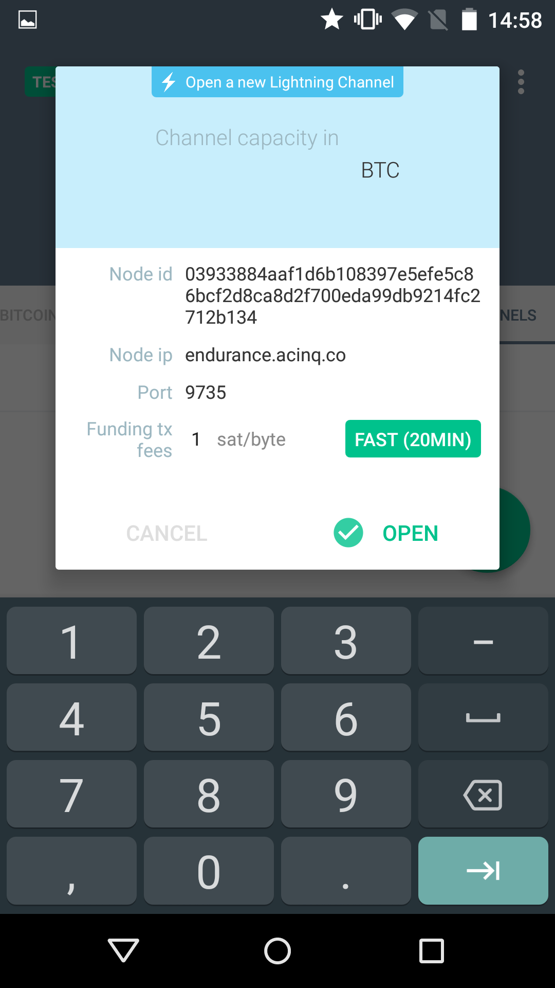
It opens a window with a hard-coded choice of the node and it only requires the user to fill in the amount to be committed to the channel. The technical information displayed (node id, node IP, and port) is not very user-friendly but it's necessary for a manual channel opening. This degradation of the experience will only be avoided when users don't need to go to that option very often.
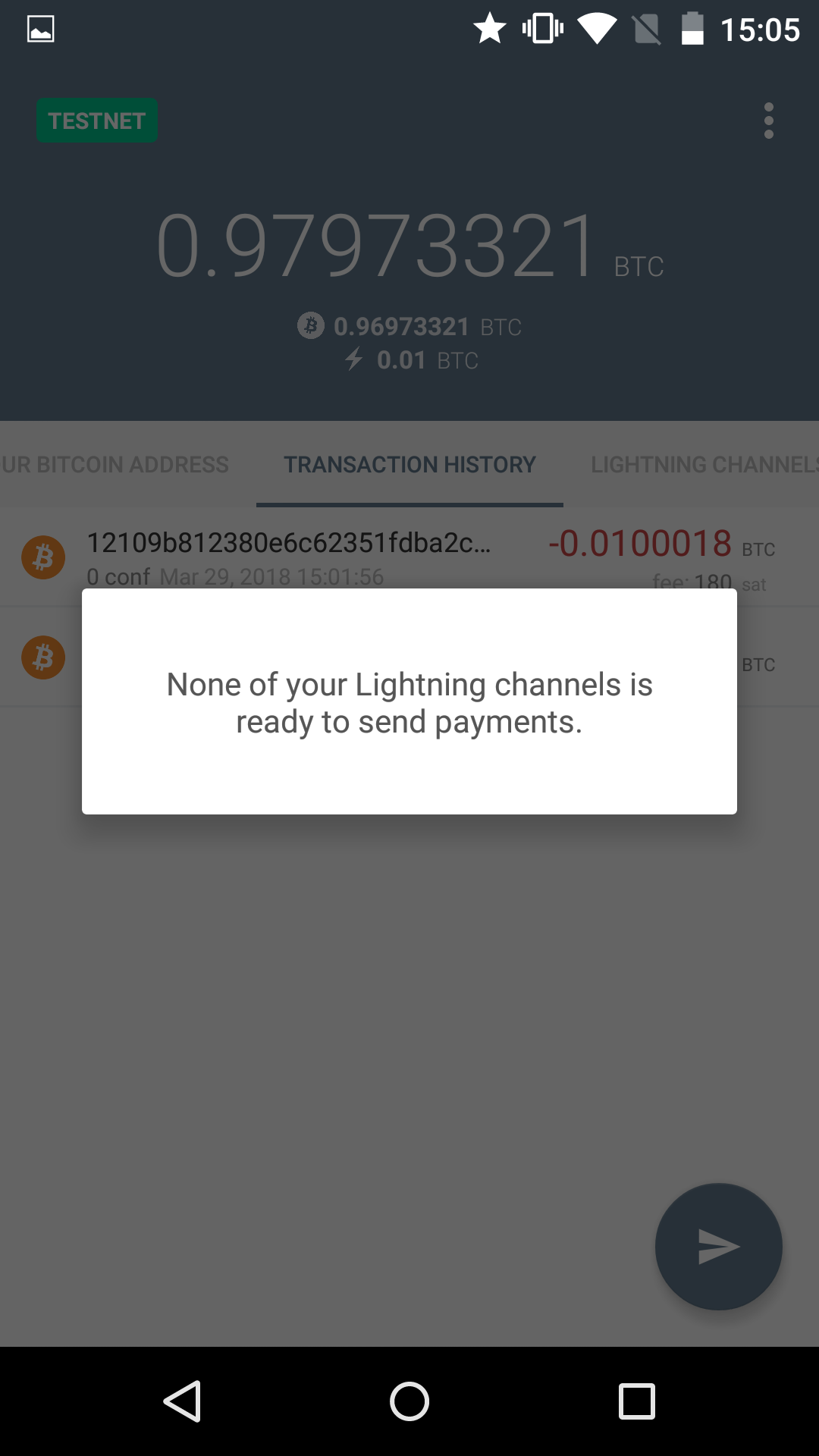
If the user decides to go for the payment now that he's asked to open a channel, but before his transaction was confirmed, he will receive a different message saying that his channels are not ready for payment. That's an important detail as, if the message was the same from the last time, it would seem like a bug/delay or the user simply wouldn't understand why he couldn't send the payment, both possibilities having the consequence of arousing more confusion.
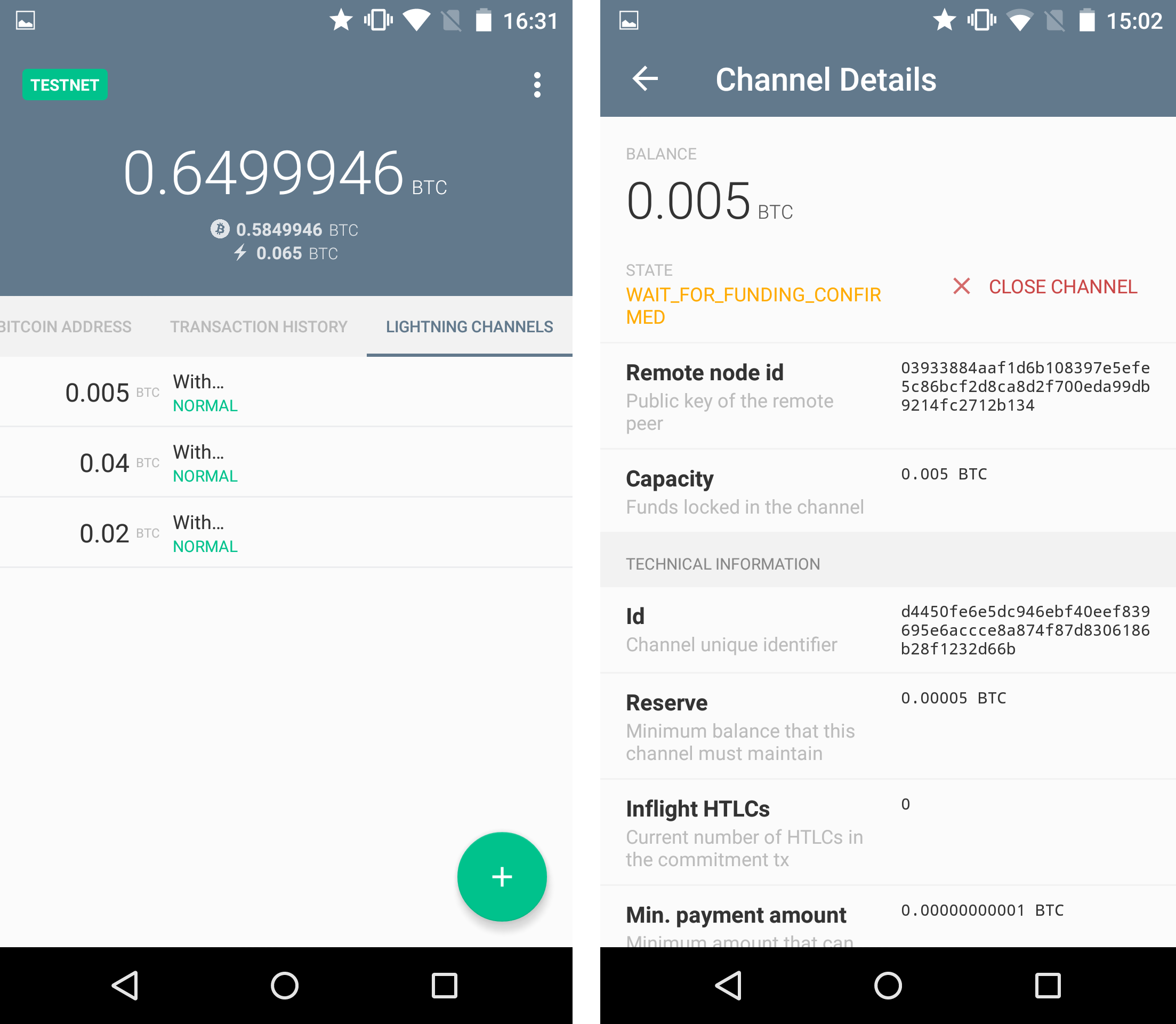
With some channels already open, we can observe that the general layout and color coding of the displayed channels is very good. There's also the possibility of seeing a complete channel information page if the channel row is clicked upon. Just the "With..." label is confusing and unclear about the message to be conveyed, but it might only be an issue from the development phase.
After having at least one channel confirmed and in the "normal" state, the payment can finally be carried out.

The window that automatically opens when the payment code is scanned shows the amount to be paid, the conversion of the amount to fiat currency in a subtle display, a "To" field, a description (if one has been given by the requester) and the identification that it's a lightning transaction. After confirming that the information is correct, the user can hit "PAY".
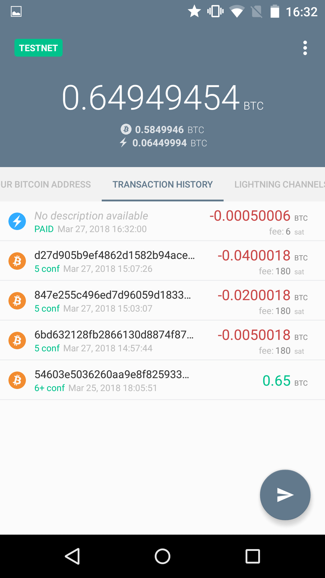
Since it's a lightning transaction, it will appear almost instantly as "paid" in the transactions list. The transaction data displayed in the transactions section is very rich for such a small available space, and it does that without getting too cluttered.
There's a clear indication through the use of badges of whether the transaction was a lightning or blockchain type. A small suggestion here would be to change the Bitcoin badge for a "chain" badge (similar to Zap) since they are all Bitcoin transactions from the user's point of view.
The complete timestamp of the transaction is shown, as well as the number of confirmations for blockchain transactions. This is particularly important as Eclair's objective is to be a general purpose wallet, so easily keeping track of confirmations will be a daily need.
The description field is only available for Lightning transactions. It would be a good future improvement to implement the possibility of putting labels in blockchain transactions, as well, to facilitate accounting. This label would replace the Transaction Id shown at the moment, and this Id could be available only on the transaction details page that can be viewed by clicking on the transaction row.
As for the right part of the page, it shows the amount transacted with a color signifier of a transaction that was sent or received. Besides, it puts a negative signal before amounts that were paid by the user. It also appends the fee paid for each transaction in a smaller and lighter print that doesn't compete so much with the main information, which is the amount.
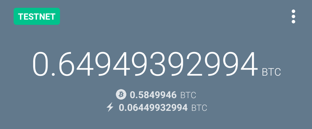
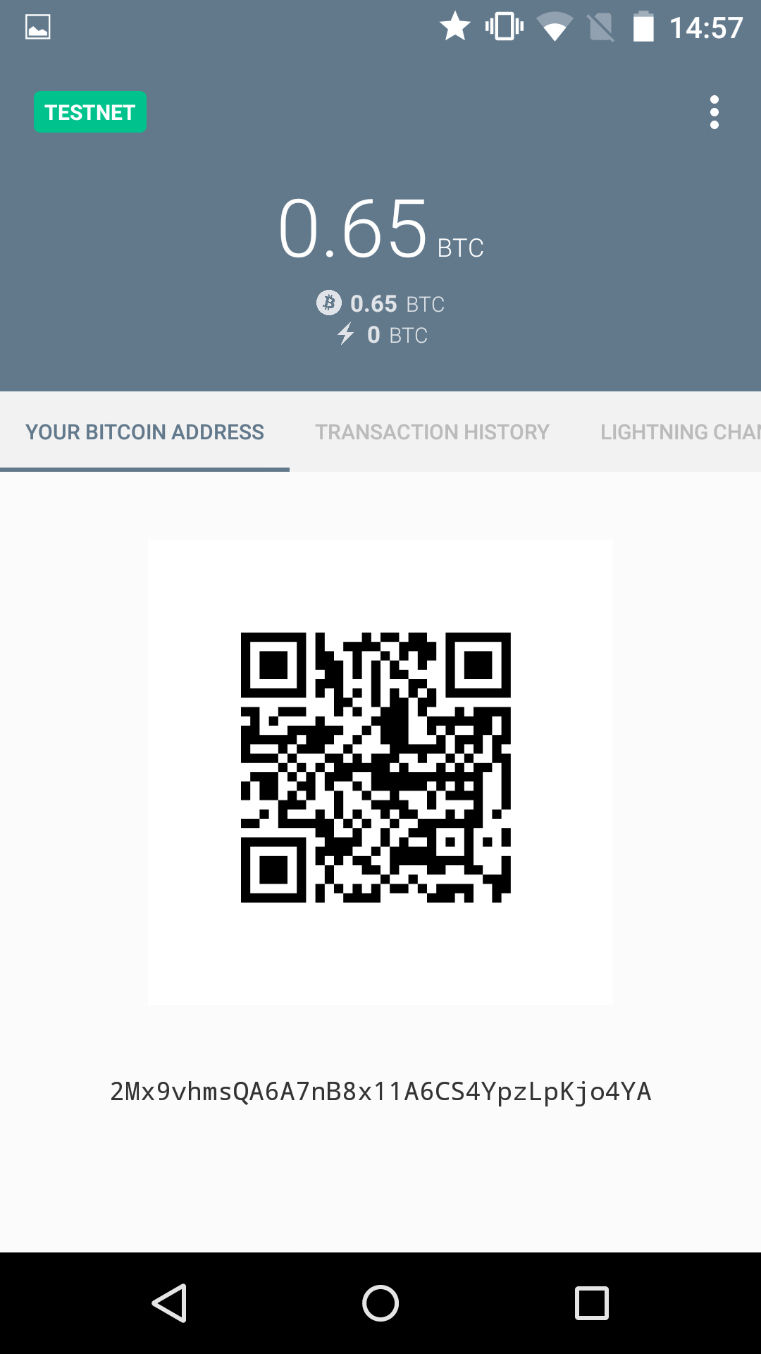
Although it wasn't mentioned until now, the wallet clearly shows the total amount of funds in a high visual priority in the screen, with the amount available for blockchain transactions and the amount committed to lightning channels right below in a lower visual priority. The only element missing from the guidelines suggested in Objective 2 is the conversion to a fiat currency that should be shown at least for the total value.
As it was said before, Eclair doesn't currently support the request of Lightning payments, making the completion of the "request" task impossible at this time. As a consequence, we will skip to some extra comments about the interface.
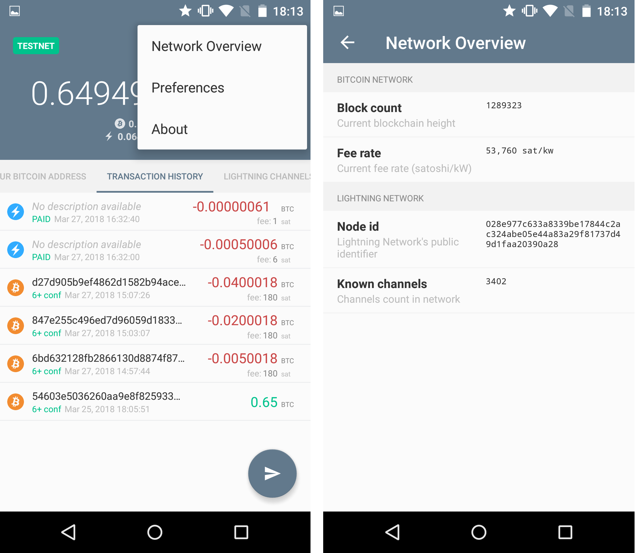
Eclair counts with a more modest view of the current state of the network, but it's more than enough for a regular user. It's further aligned with the suggestion this study made earlier when analyzing the Zap interface because it keeps this network section in a hidden menu, so it doesn't compete for attention with more important elements. Also, it presents information about both the blockchain and the Lightning network, which makes sense with the intention of being a general purpose wallet.
The approach that the Eclair's team seem to be taking is to make things work with few features to later increment them, so it looks like a very promising development. For the future phases, this study will leave the suggestion of increasing user freedom and control over some actions, for instance: allowing typing in input fields, adding custom label options and allowing to create payments with a pre-defined requested amount (both for the blockchain and the Lightning Network).