Objective two: Visualizing the user interface
The stage of restricted use and high risk described in Objective 1 is expected to end in its due time when the development reaches a more mature state and the Lightning Network will evolve to be part of regular user interfaces, as it is the case with common Bitcoin wallets. The mental exploration of what those interfaces should look like is the second objective of this study.
Phase 1 wallets
Let's call the stage with no user interface available the Phase 0 of the Lightning Network development. Phase 1 would be, then, the following stage, where the first interfaces are already functional and compatible with the abilities of the 3 described users.
This is a period when all the operations that were done through the CLI in the first part of this research are properly integrated into a graphic user interface. On the other hand, there might be quite a few structures for the Lightning Network that are not yet built or are not completely mature (e.g. automated network discovery systems) and to wait for the integration of these systems with the regular wallet's APIs and functions might result in delaying the launching of usable Lightning wallets. Also, it will take time for the Lightning-enabled wallets to be considered really battle-tested and, during this period, a series of bugs and unexpected behavior might come to light. As a consequence of those two aspects, it makes sense that the first wallets to be made available are especially dedicated to Lightning operations and not general purpose wallets. That is both because of timing so that Lightning wallets can start to be used and tested as soon as they are sufficiently secure and functional, and because of the security risk of adding new features with unknown effects in a wallet holding the user's main funds. The ideal and general purpose wallets will be described further in the Phase 2 wallets section.
The general consequence in terms of User Experience is that, even though all 3 typical users will be able to use the wallet, the extra learning effort of having a specialized wallet for the Lightning Network might alienate the third user, Jennifer, until the next phase. Also, this will mean that actually two blockchain transactions will be required to open the first Lightning channel (and subsequent channels in case the wallet runs out of funds), since the user will need to send a regular Bitcoin transaction to fund the wallet and then a second transaction will be made to open a channel. However, this is considered a minor problem given the above-stated reasons for adopting this type of wallet while the Lightning development matures.
What will not be left for Phase 2 is the ability of wallets to bootstrap themselves and automatically manage channels without the requirement for user input. The importance of this aspect lies upon the fact that, when the user doesn't need to manage his channels manually, the main break on his mental model of how a Bitcoin wallet should work gets out of the way. Or, in case of a completely new user to cryptocurrency, such as Jennifer, the learning needed to get the first transaction going is smaller and more intuitive (send and receive transactions). With time, the user can get curious and understand what the channels section is about and how to operate it, but it doesn't get frustratingly in the way of regular payments.
In order to imagine what the wallet should look like, we are going to do a task analysis of three main flows of action that need to be contemplated:
- Wallet Setting
- Sending payment
- Requesting payment
The guidelines and wireframe sketches on this section are limited to specific tasks and situations that were prioritized in the explanation, but this doesn't mean a real implementation of a Lightning wallet should limit itself to only these operations. They are purposefully low fidelity drawings, in order to focus on the elements and the general architecture instead of aesthetic aspects of design. In addition, the suggested structures are not being presented as the only forms of designing good user interfaces, they are just an approach to visualize the elements that should be prioritized when doing so.
Setting up the wallet
The first flow is common to all Bitcoin wallets, not only the ones for the Lightning Network. Nevertheless, it's such a crucial part of the interface that it will be included here anyway, with the following sketches and items being used to highlight usability concerns of this implementation.
- Setting up the wallet for the first time (same as to regular Bitcoin wallet)
- A choice between creating a new wallet or recovering an existing one.
- Chooses to create a new wallet and the mnemonic code is displayed.
- The mnemonic code is verified.
- Other security setups are offered (passphrase, 2FA, etc).
- The wallet is ready.
Set up pages
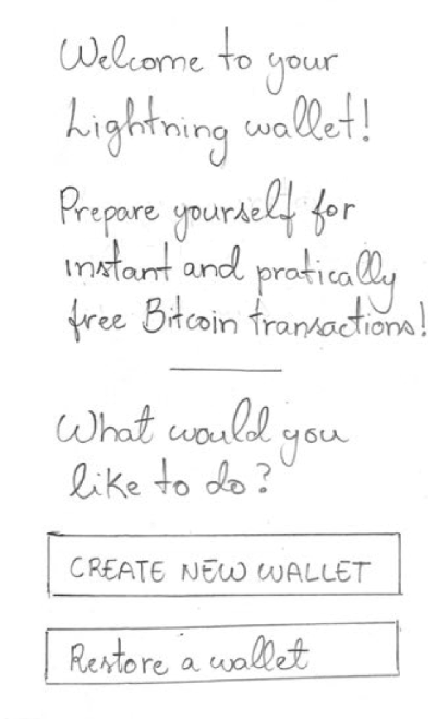
First screen seen by the user.

Screen showing wallet seed (after the user chose to create a new wallet).

Screen for mnemonic code verification (one word at a time).
Comments about the interface:
- The first screen should be a simple choice for creating or recovering a wallet. With the "Create new wallet" button more prominent since that's what "clueless" users will likely want to do and they should be indicated that that's the most common choice.
- Wallet backup should come on the next screen and work as an interlock, i.e., the user should be constrained to begin using the wallet without going through the backup steps.
- The seed (BIP39) scheme is the more user-friendly form of backup.
- Clear but short instructions about what to do with the mnemonic code and its importance should be given. It could be organized in bullet points or other short structure, aided by the use of bold or differentiated characters to highlight important parts. A link to a more detailed explanation of how to make a safe backup is a good call and should be more prominent than the text, but less than the list of words. That way it gets user attention but doesn't distract the person when she's writing down the words.
- The mnemonic code should be organized in a clear way, with no ambiguity in the order of words and, preferentially, numbered (so the user can see more quickly if he's missed a word).
- The software should avoid triggering the mobile behavior of capitalizing first letters or take care of the input normalization in the backend, as it would make an otherwise valid word appear as invalid, causing user confusion. Another option is to prohibit the user from writing anything that isn't a valid word from the mnemonic code. That can be done using the property of the mnemonic words, which can be identified after the first 4 letters are written.
- The verification of words is important to make sure the user didn't make a mistake in the copying process. All words can be requested, one at a time, or an incomplete list can be shown for them to complete the missing ones. The later will be more effective in the verification, although it will require more time and effort from the user.
- Wrong words, i.e words different from the one expected for that input field, should be highlighted readily after the user writes them and not only when he tries to verify the whole list (this is especially valid in the cases the interface is not asking one word at a time).
- A list of suggested words based on the partial user input can accelerate the verification process and give a quicker feedback if he has the correct words.
- An option to generate a new seed should be available in case the user realizes he's made great mistakes in the copying process (or maybe he tried to skip the copying altogether because he thought he could get away with it).
- Other security setups might be prompted to the user, such as password settings and 2FAs, but he should be able to go through without completing all of them (given that the proper warning is displayed) and he should be able to set those up at any time in the settings section inside the app.
Making a Payment
The second flow consists of sending a transaction in the Lightning Network. This scenario counts on the user having external access to the payment request he wants to send money to.
- Wants to send a transaction via Lightning Network.
- Opens payment section.
- Pastes/writes/scans payment code/address.
- Writes amount to be sent (in case it wasn't specified in the payment code).
- Optionally, writes a label for that transaction.
- Hits "PAY".
Payment page

Screen for making a Lightning Network payment.
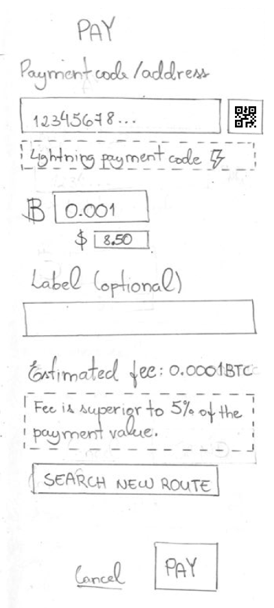
Screen for making a Lightning Network payment with the warning of an expected high fee.
Comments about the interface:
- The multiple options of scanning a QR code, writing, or simply copy/pasting the address that should receive the money are already widely adopted in Bitcoin applications, but it's important to mention them as best practices, anyway.
- When the user inputs the address or lightning payment code, the wallet should promptly give the feedback of what type of address it is (Lightning or blockchain).
- The idea of a self-bootstrapped wallet is that it will connect itself to a number of relevant peers in a way that, in most cases, there will already be a route for any payment the user might want to make. Nevertheless, it might come a time, especially in these early stages of the network, that a path can't be found and the wallet will need to open a new channel before doing the Lightning transaction. In that case, the best option is to warn the user that the transaction will take longer and require an extra fee because it will need to make a blockchain transaction to open a channel.
- As it was already stated, the process of opening new channels should be automated by the wallet's backend, removing any burden from the user having to perform this operation manually. Nevertheless, the user should be able to open channels manually if he specifically desires so. The suggested structure for how this feature should be implemented will be discussed further.
- The fee estimation for the route chosen by the wallet's backend should be displayed with a warning if the fee seems too high. The definition of a high fee could be a market-established one that is used by default, with the possibility for the user to set his own threshold in the settings section.
- The amount can be written in the Bitcoin field or in the fiat currency field, with one autocompleting the other using the current Bitcoin price. Both the fiat currency and the unit of Bitcoin should be available for the user's personal configuration in the settings section.
Requesting a payment
The third basic flow to be covered is the request for a payment. The publication of the payment information will be handled outside the wallet client (e.g. sending by e-mail), unless the payer is physically present and, consequently, able to scan the QR code information.
- Wants to receive a transaction via Lightning Network
- Opens request section.
- Optionally writes amount to be requested.
- Optionally writes a label for the request.
- Clicks "REQUEST" button.
- Sends/publishes payment request.
- Waits for payment to be completed by the other party.
Request page
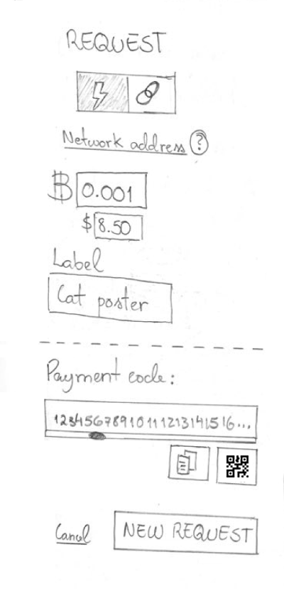
Screen for making a Lightning Network payment request.

Screen for a blockchain payment request, i.e. getting an address.
Comments about the interface:
- Like the PAY section, it should be possible to add the amount in fiat currency or BTC. The one provided will be used by the wallet to autocomplete the equivalent amount in the other currency based on updated price.
- The top of this section should present an easily perceivable choice between "Lightning payment" or "Funding wallet" in case the user wants to see a blockchain address to add funds to the wallet. The default, however, should have the Lightning payment selected, since it's the main use for this wallet.
- When the "Funding wallet" option is selected, the screen should show a regular Bitcoin request, with a blockchain address available to receive transactions.
- When "Lightning payment" is selected, a link to show the "network address" may be available, in case the user wants to share his peer's address as a way for others to open a channel directly with his client, even though this is considered an advanced feature.
- When clicking the "REQUEST" button, the payment code should be displayed on the same screen so that the user can double-check the information he provided previously. But the information should not be editable anymore, to make it clear that he will have to generate a new code in case any input changes.
- A link to "generate new request" should be provided in case the user does want to change any of the inputs. By clicking it, the input information should become editable again (preferentially not being erased) and the previously generated code should disappear.
- The payment code should be selectable (for copying).
- It would improve usability to also have buttons with the appropriate icons for directly copying the code and for showing its representation as a QR code.
Extra pages
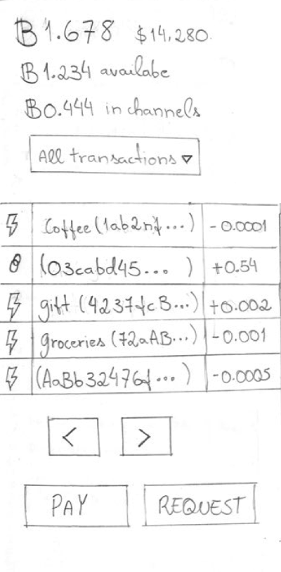
Dashboard page
Now that the most basic flows were covered, let's take a look at other relevant pages, starting with how the dashboard page (the main page the user sees when he enters the wallet) could look like.

Screen for the dashboard (home) page.
Comments about the interface:
- The PAY and REQUEST button should be the more prominent elements of the screen since they are the main actions a user would need.
- In the case of desktop or browser wallets, it would be best to make the PAY and REQUEST button available on all screens. This might not be optimal in mobile wallets because of limited space and clutter.
- A summarized display of the wallets funds should be seen, with the separation of total funds, available funds and funds committed to Lightning channels.
- The main items to show in the navigation are dashboard page, Wallet page (where all transactions can be seen), Channels page (where channels can be seen and managed) and Settings page. These items should be visible for an easy discovery, while other necessary items can be less visible if there isn't much available space for displaying or if there are too many items and a visual hierarchy has to be applied. For example, if building a mobile application, the four main items could be in a tab-style navigation, while the others could be in a hidden menu.
- This page is also where general warnings and messages should be prompted to the user, such as that a new version is available or that some setting should be reviewed, etc.
- The current exchange price of Bitcoin might also be displayed in a more subtle manner, as this is still considered a relevant information by most users.
Wallet page
Wallet screen, i.e. where transactions are listed.
As for the "wallet" page, where transactions will be shown, the main issue is to make a differentiation between lightning and blockchain transactions. Other options such as being able to filter transactions by type (blockchain, Lightning Payment, Lightning request, all Lightning) are also nice to have. Apart from that, the already established best practices for displaying transactions should be applied, such as ordering from most to less recent, showing number of confirmations, displaying the chosen label (when there is one), giving a link to a block explorer service, color coding money that has been received and money that has been sent, etc.
In this particular sketch of a mobile wallet, the transaction rows are links to the expanded transaction information, due to the lack of space for directly displaying everything.The last page to be analyzed will be the Lightning channels section. These are the most important elements to be considered:
List of channels with information about the peer, amount committed and the current status of the channel.
The possibility of manually opening a channel with a specific peer.
Filter for channels based on their status would be a nice to have.
Channels page
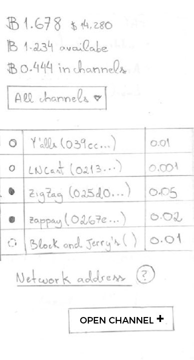
Channels screen, i.e. where open channels are listed.
In the Lightning channels section, the most important elements to be considered:
- List of channels with information about the peer, amount commited and the current status of the channel.
- Possibility of manually opening a channel with a specific peer, even though it's an advanced feature and should be treated as so (for example: give the user a warning about the operation or only making this option available if the user enables it on the settings section).
- Make available the user's network address with a small explanation of why the user might need it (represented here by the interrogation mark that can be hovered on or clicked).
- Filter for channels based on their status would be a nice to have.
Open Channel page

Screen for opening a new channel manually.
At last, we get to our final screen, which is where the user is able to manually open a new channel. Due to the risks associated and the particular difficulty in understanding the information on this page, this is considered an advanced feature. However, it's important that it's included in a Lightning Network wallet, even if, as suggested above, it's a page that needs to be deliberately enabled in the settings page.
The main elements that should appear here are the following:
- An input field for the peer address with a numeric representation of what is a peer address, like a placeholder. The user should also be able to scan the peer address that can be provided by third parties as a QR code.
- A field for searching the peer by name. It's not as reliable as the previous but it can make the identification of the peer a lot easier if the peer in question has an alias set for himself.
- The amount that the user wants to commit to the channel with the proper conversion to fiat currency.
- A conventional choice of the transaction priority, since it's a blockchain transaction, with the expected fee being updated depending on the priority choice. Note that no drop-down option was used here because the number of options is limited to three, so there's no reason to degrade the discoverability of the values.
Phase 2 wallets
Phase 2 wallets will be the clients developed in a future state of the network when the technology is more mature and battle-tested. In that scenario, the proper interface will not put any burden on the user of having to perform different operations for Lightning or regular Bitcoin transactions. The same wallet will be used for any type of transaction and the same "PAY" and "REQUEST" sections will work no matter what type of transaction the user decides to do. The software will be responsible for recognizing what type of inputs are being given (what type of address/payment code) and act accordingly to the type of transaction that is expected.
Let's explore the same three activities we analyzed on Phase 1 wallets to see what changes should be expected in this new type of wallet.
1. Wallet setting
It will be based on the same principles, so no further analysis is necessary.
2. Sending payment and 3. Requesting payment
- The basic flow should be exactly the same, only, now, the wallet will have both blockchain and lightning transactions with the same degree of importance to the user.
- On the REQUEST page, a more advanced option of for blockchain transactions should be implemented, giving the user the possibility of creating an advanced request (with the amount already filled in). In order to avoid unnecessary clutter, since it's very common for users to just want the address, this should be hidden under a "advanced options" link.
- The page for Lightning channels will be less important in the general wallet hierarchy because the opening and closing of channels should be even more seamless for the user. At the same time, it has to continue existing so users can manually open channels if they have that need. The solution is to remove this section from the main navigation elements and put it in a hidden or contextual menu (in case there's reason for a Lighting submenu).
The conclusion we can take from the Phase 2 analysis is that the main differences will occur in the wallet's backend and in the conceptual model passed to the user that this is now a general purpose wallet. The interface itself will need very few modifications. Nevertheless, the usage simplification of only needing one wallet, together with the fact that more standards and best practices will have been established by then is the necessary usability evolution that will fully integrate Jennifer, our third persona, as a user of the Lightning Network.